Groops
Brand Identity
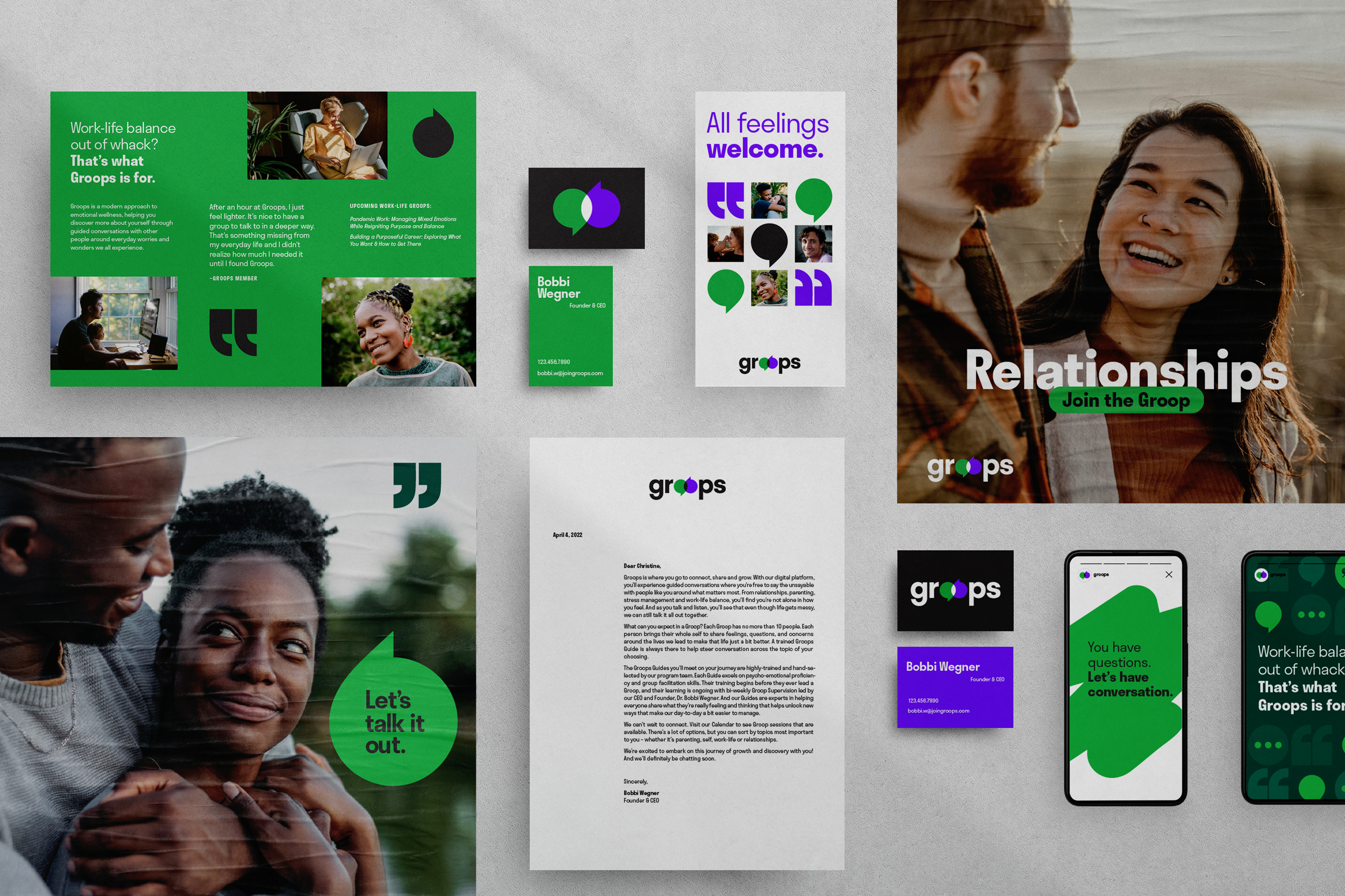
Groops is a mental wellness platform that gives people a space to talk about life’s biggest issues. The brand identity was designed to reflect the brand’s modern approach to mental wellness while highlighting the bold and illuminating conversations members have through Groops.
Agency: Colle McVoy for Groops
Designer: Catherine Bretheim
Digital Designer: Sam Gordon
Design Director: Diana Quenomoen
Strategist: Casie Cook
Copywriter/ACD: Zach DeBlaey
Designer: Catherine Bretheim
Digital Designer: Sam Gordon
Design Director: Diana Quenomoen
Strategist: Casie Cook
Copywriter/ACD: Zach DeBlaey
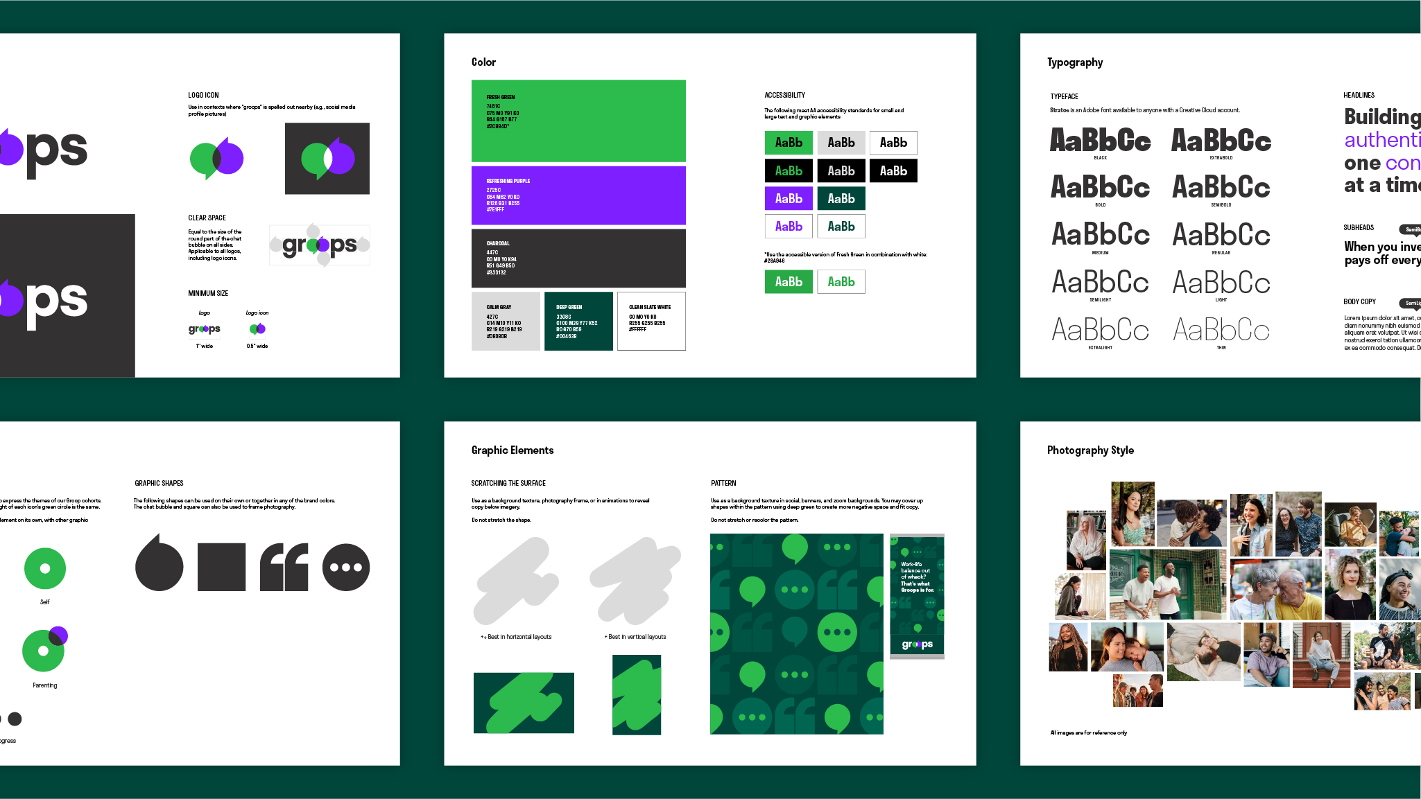
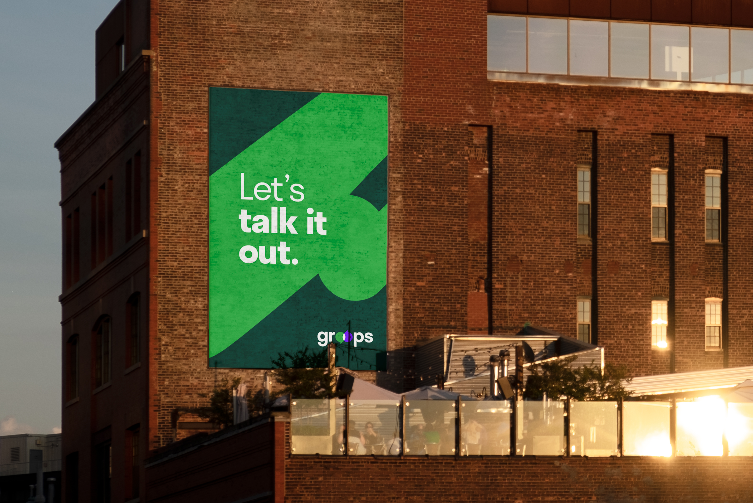
The logo transforms Groops’ “O’s” into overlapping speech bubbles to highlight the power of conversation.
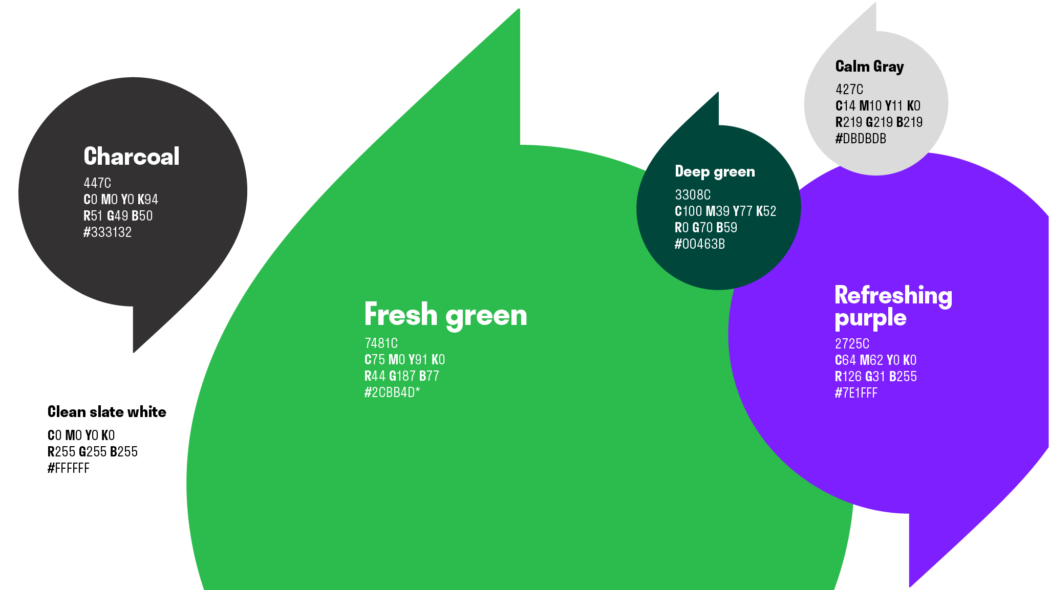
Our bright and refreshing color palette stands apart from the competition's subdued hues and conveys the raw candor that Groops encourages in their virtual conversations.
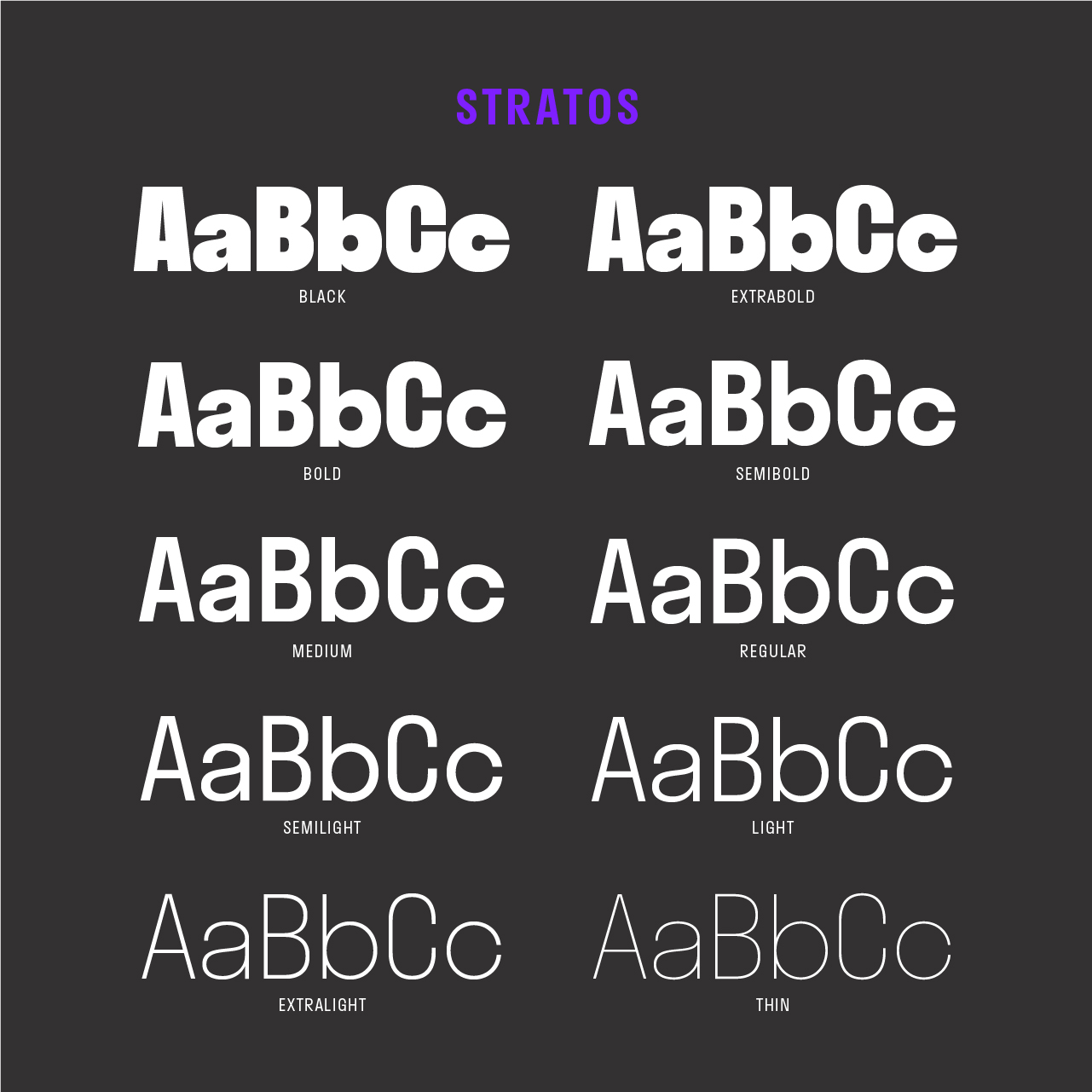 The brand system utilizes a typeface with various weights and narrow letterforms that allow for a strong type hierarchy system and reflect the brand's modern approach to wellness.
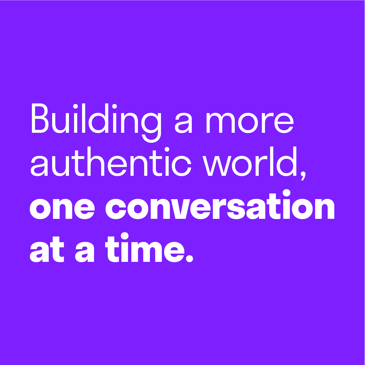
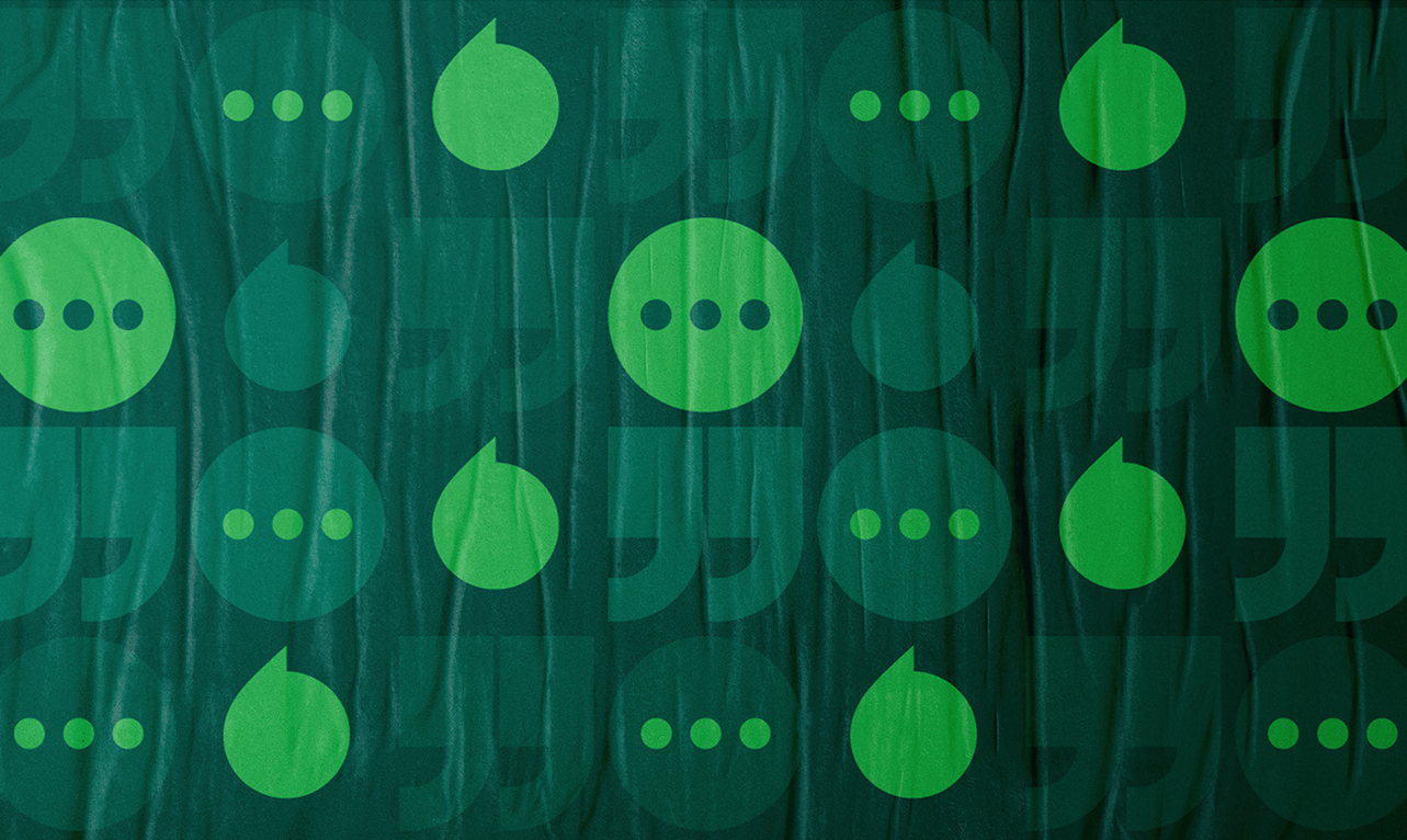
Our patterns highlight the open conversations that happen in Groops.
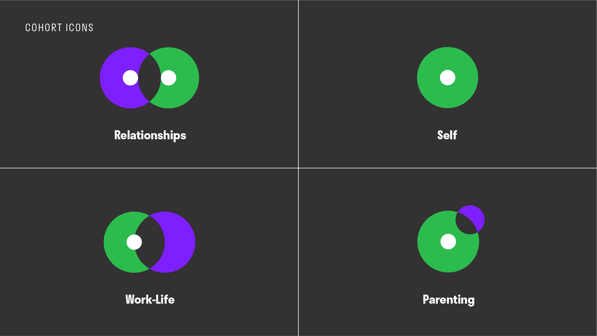 The brand’s iconography system pulls from the logo’s round shapes to embody Groops’ unique cohorts.
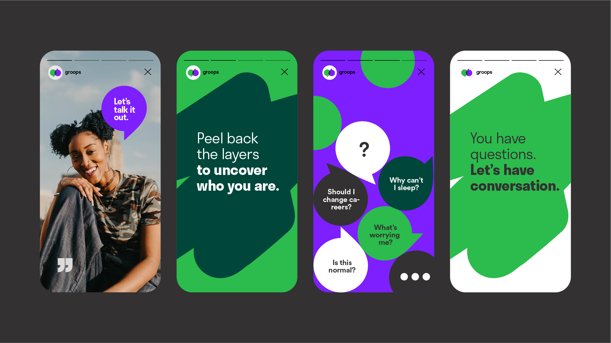
Our warm editorial photography style captures raw and candid moments to convey the authenticity members can expect to feel when joining Groops.

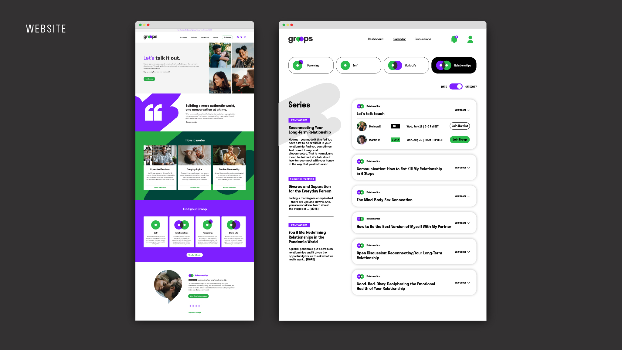
Our digital redesigns – from email, to web, to the member dashboard – greet current and future members with a refreshing, bold, and easily navigable experience.