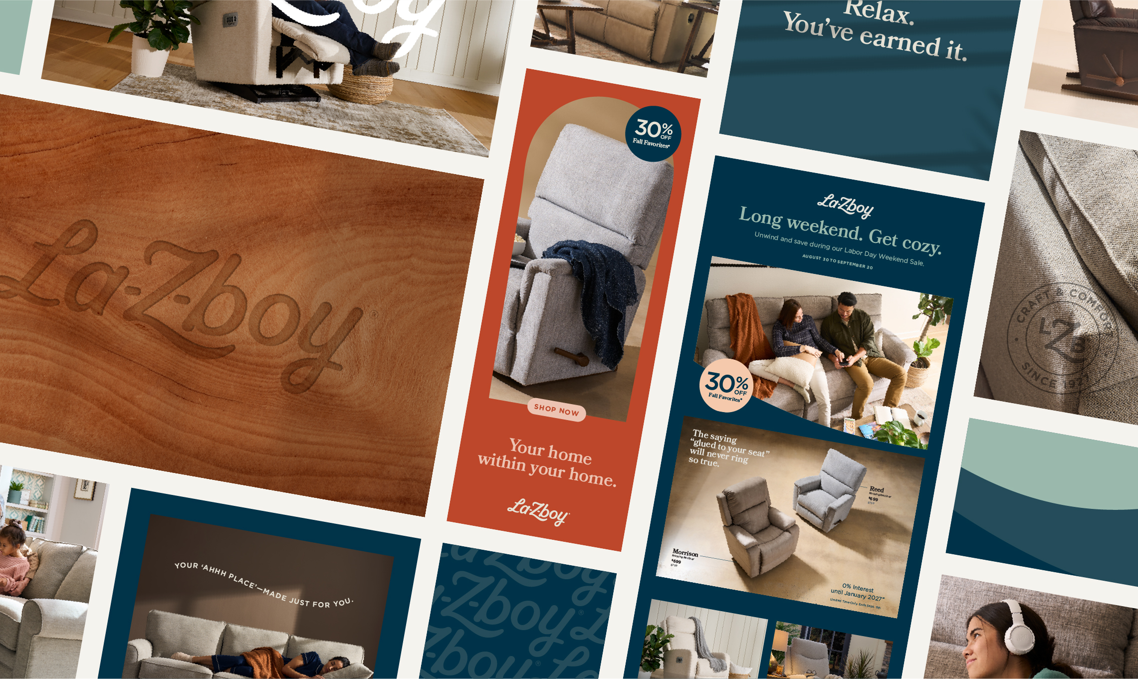
La-Z-Boy
Brand Identity
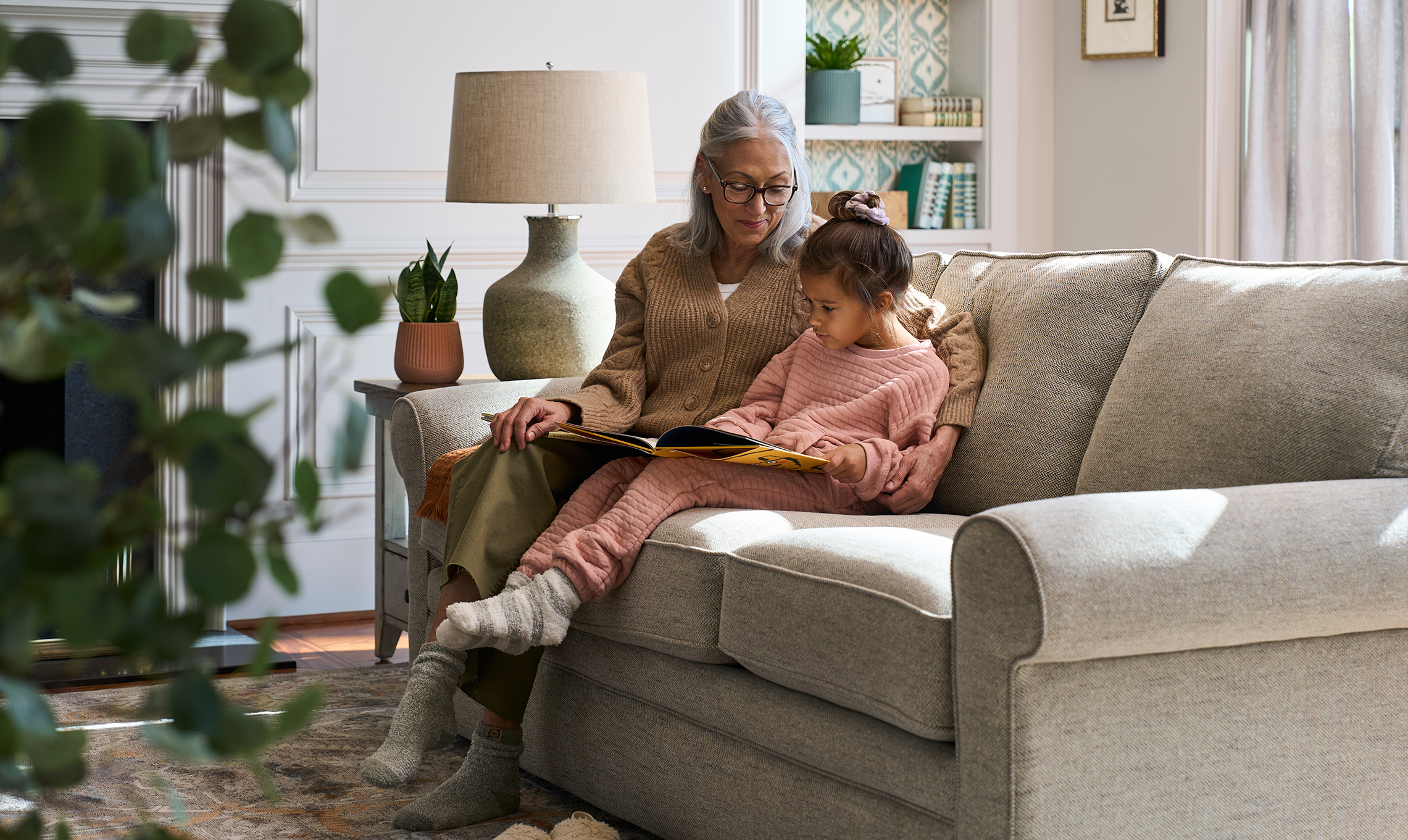
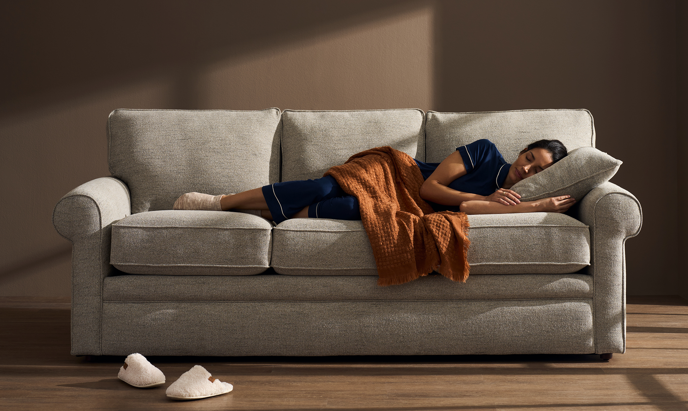
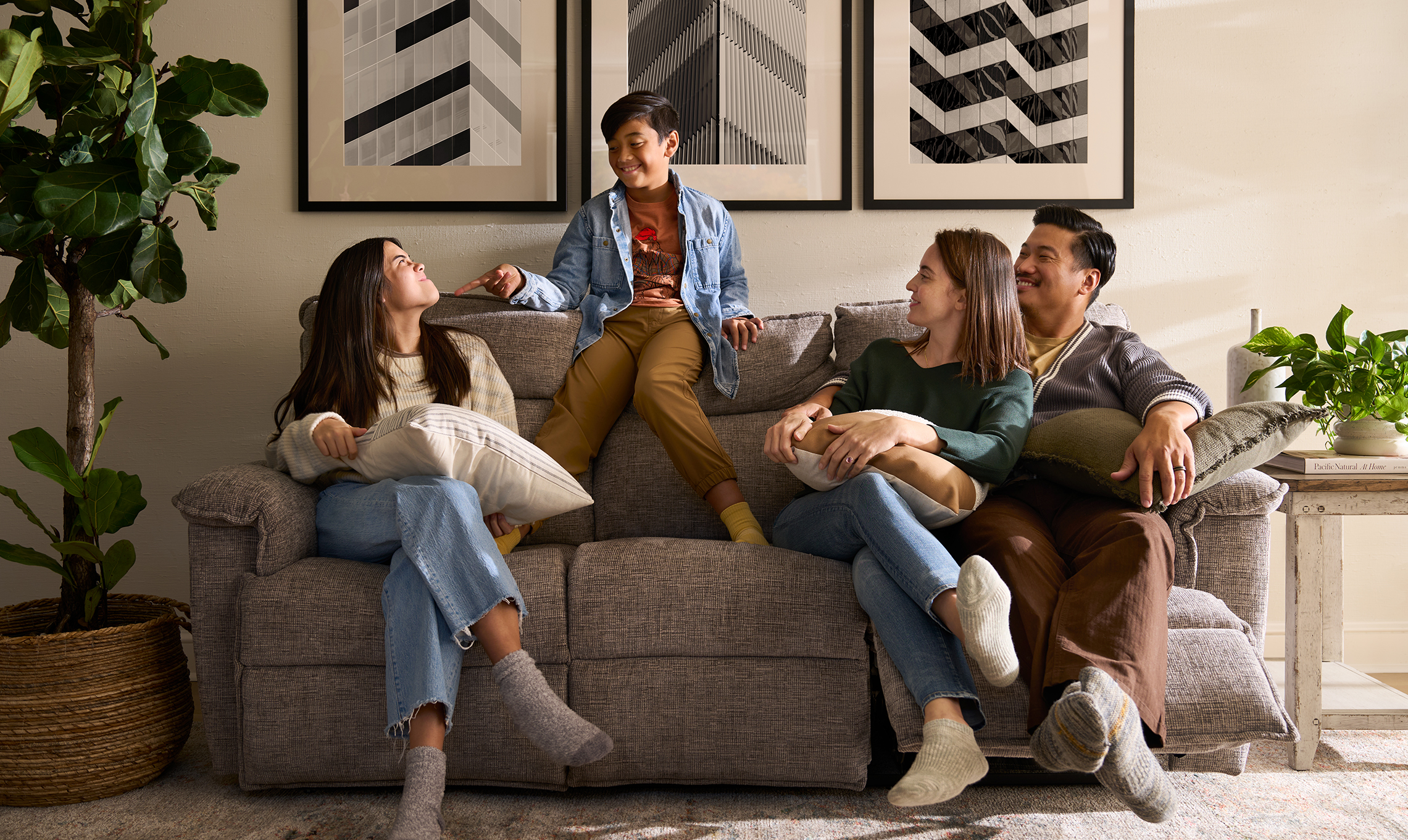
Working alongside La-Z-Boy leadership, we crafted the new identity to honor La-Z-Boy’s legacy while reimagining its future. What started as a chair became a sanctuary, and what began in function evolved into feeling. Your “ahhh” place.
The refreshed brand marks La-Z-Boy’s evolution from furniture maker to modern lifestyle brand. From utility to emotional refuge. Every expression is as intentionally crafted as the products themselves: soft in form, warm in tone, and built to last.
The refreshed brand marks La-Z-Boy’s evolution from furniture maker to modern lifestyle brand. From utility to emotional refuge. Every expression is as intentionally crafted as the products themselves: soft in form, warm in tone, and built to last.
Senior Designer: Catherine Bretheim
Associate Design Director and logo designer: Robert Pflaum
Group Design Director: Diana Quenomoen
Senior Copywriter: Ryan Seibold
Motion Designer: Nate Miller and Dawn Charbonneau
Executive Creative Director: Gil Muiños
Associate Design Director and logo designer: Robert Pflaum
Group Design Director: Diana Quenomoen
Senior Copywriter: Ryan Seibold
Motion Designer: Nate Miller and Dawn Charbonneau
Executive Creative Director: Gil Muiños
Typography that balances heritage, modernity, and sophistication.
A warm, sensory palette grounded in calm.

Voice and vision in harmony.
Comfort isn’t just how something feels. It’s how it sounds. The new voice is confident and inviting. Clever without trying too hard. Reassuring without ever being soft. It’s a tone that’s down to earth, emotionally aware, and ready to exhale. It meets customers where they are by acknowledging what quality furniture needs to do both mentally and physically.
More than a makeover. A north star.
The new identity is more than aesthetic. It’s a strategic shift and a guiding light for the brand internally and externally. It anchors La-Z-Boy’s omnichannel growth, retail reinvention, and digital transformation—ensuring the brand can live consistently comfortable across every touchpoint.


We shared the new identity with a group of analysts, and one of them looked at it and said, “I get it. That’s comfort.” When a financial analyst can instantly grasp the essence of the brand, it speaks volumes about the power and clarity of this new identity.
— Christy Hoskins, VP, Chief Marketing Officer at La-Z-Boy
Roundel
Brand Refresh, Art Direction
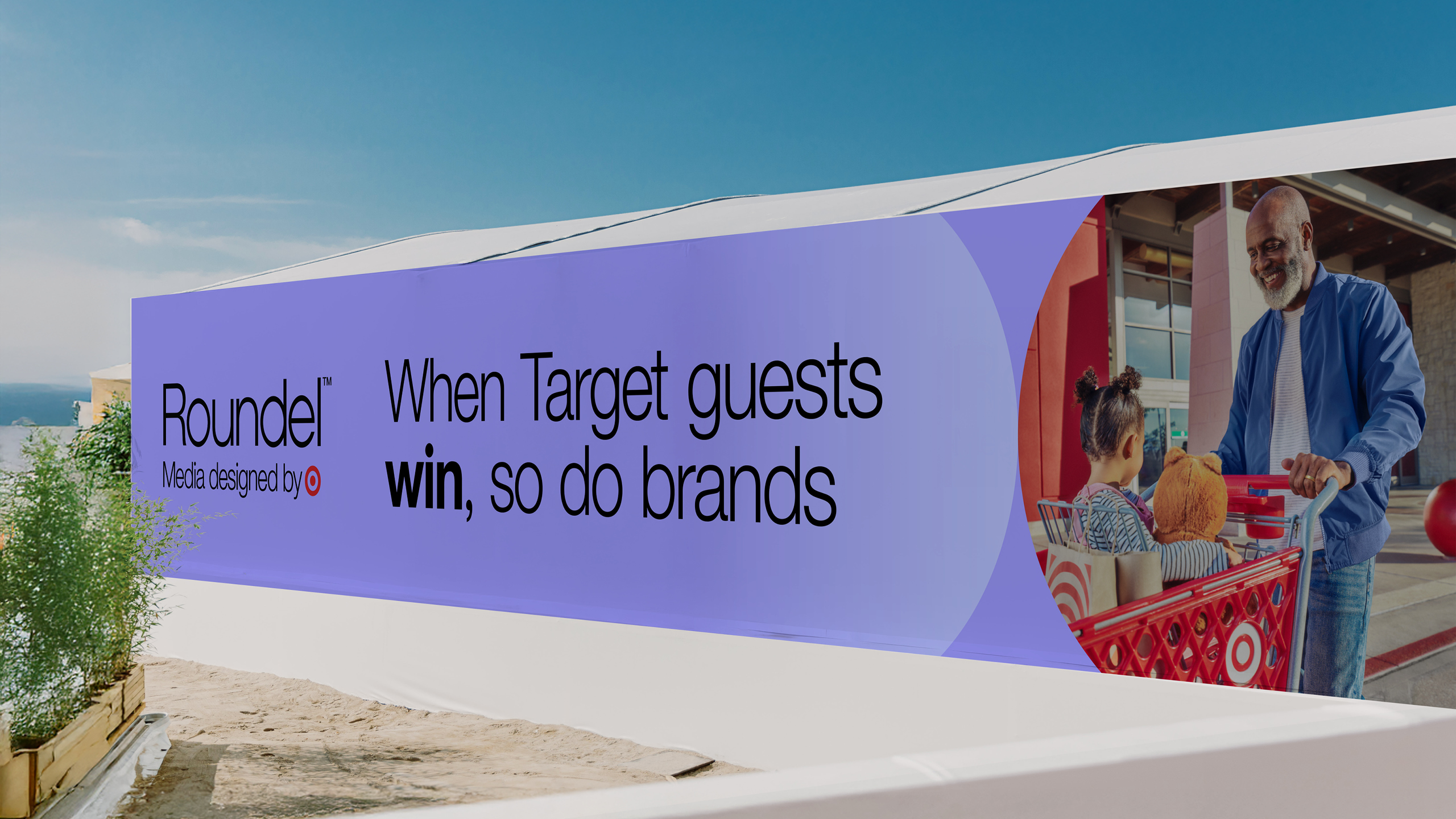
Roundel’s key differentiator, its connection to Target, was lost in translation. Up against retail media network competitors (e.g., Walmart Connect, Amazon Ads, Instacart Ads) whose names do the heavy lifting, Roundel needed a brand platform and visual identity that made a clearer tie to its parent brand.
We developed a brand platform, Joy is good for business, that bring’s Roundel’s unique selling point to life: the joy Target guests experience in store, the splurging that results, and the powerful impact that can have on media buyers’ campaigns.
We developed a brand platform, Joy is good for business, that bring’s Roundel’s unique selling point to life: the joy Target guests experience in store, the splurging that results, and the powerful impact that can have on media buyers’ campaigns.
Senior Designer: Catherine Bretheim
Interactive Designer: Molly Hoopingarner
Senior Copywriter: Ryan Seibold
Executive Creative Director: Gil Muiños
Design Director: Dustin Hackwith
Group Interactive & Experience Design Director: Patrick Anders
Photographer: Talia Green
Retoucher: Bryce Bordenkecher
Interactive Designer: Molly Hoopingarner
Senior Copywriter: Ryan Seibold
Executive Creative Director: Gil Muiños
Design Director: Dustin Hackwith
Group Interactive & Experience Design Director: Patrick Anders
Photographer: Talia Green
Retoucher: Bryce Bordenkecher
We refreshed their
brand identity to capture
the energy, momentum and results that Roundel creates for brands and media
professionals.
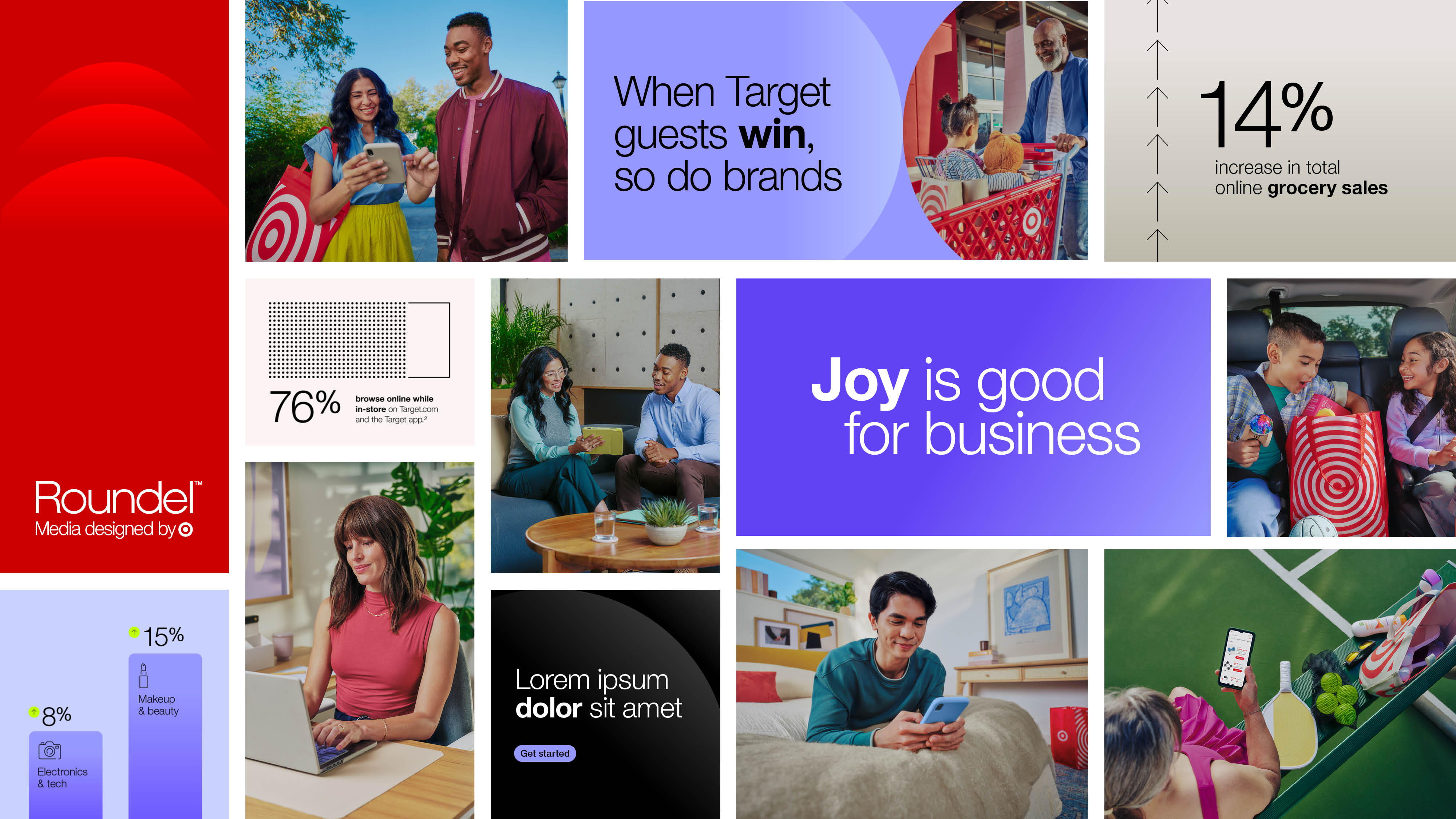

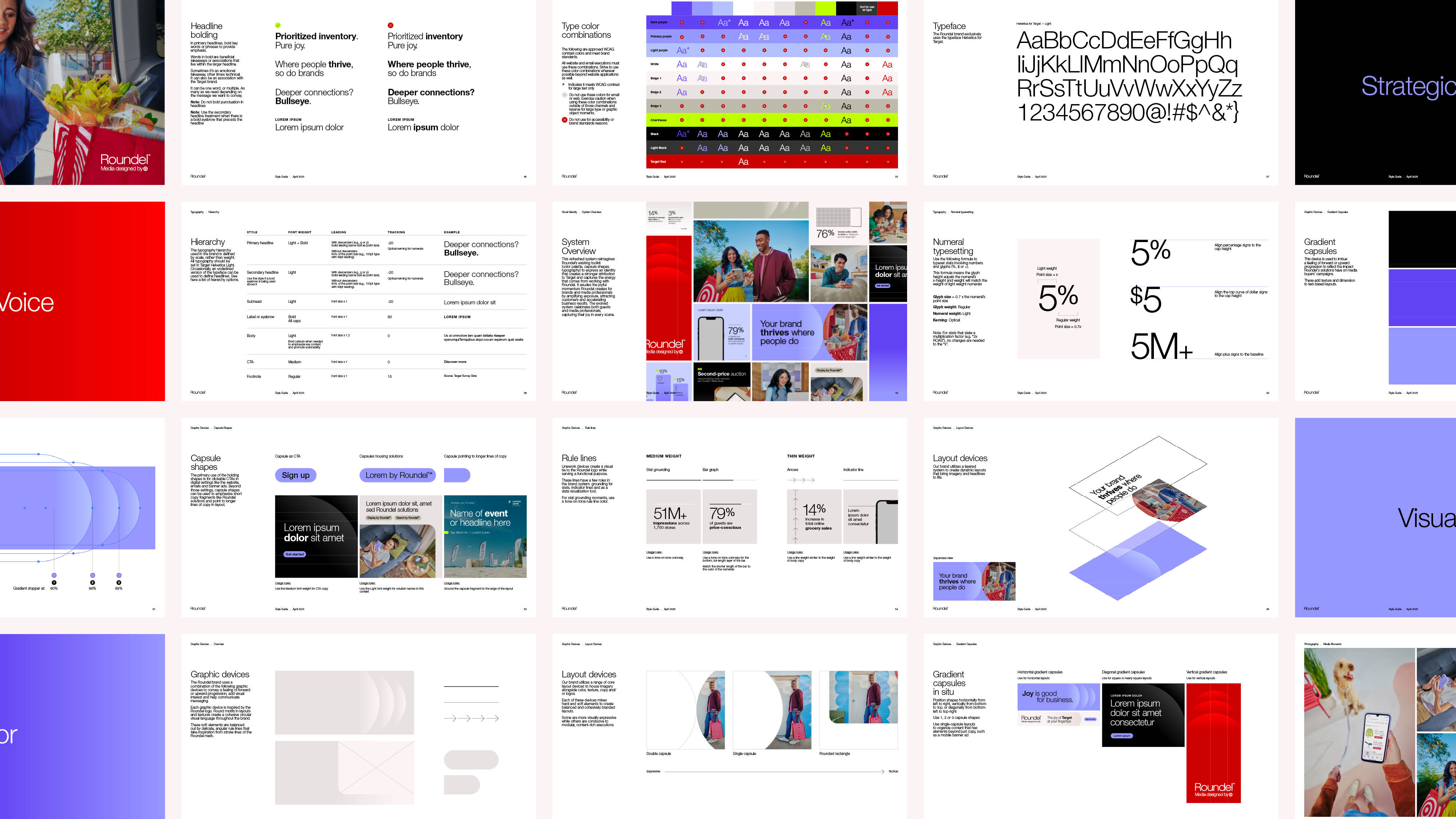
We infused their graphic system with gradients and textures that express the forward and upward trajectory of media buyers’ campaigns with Roundel.
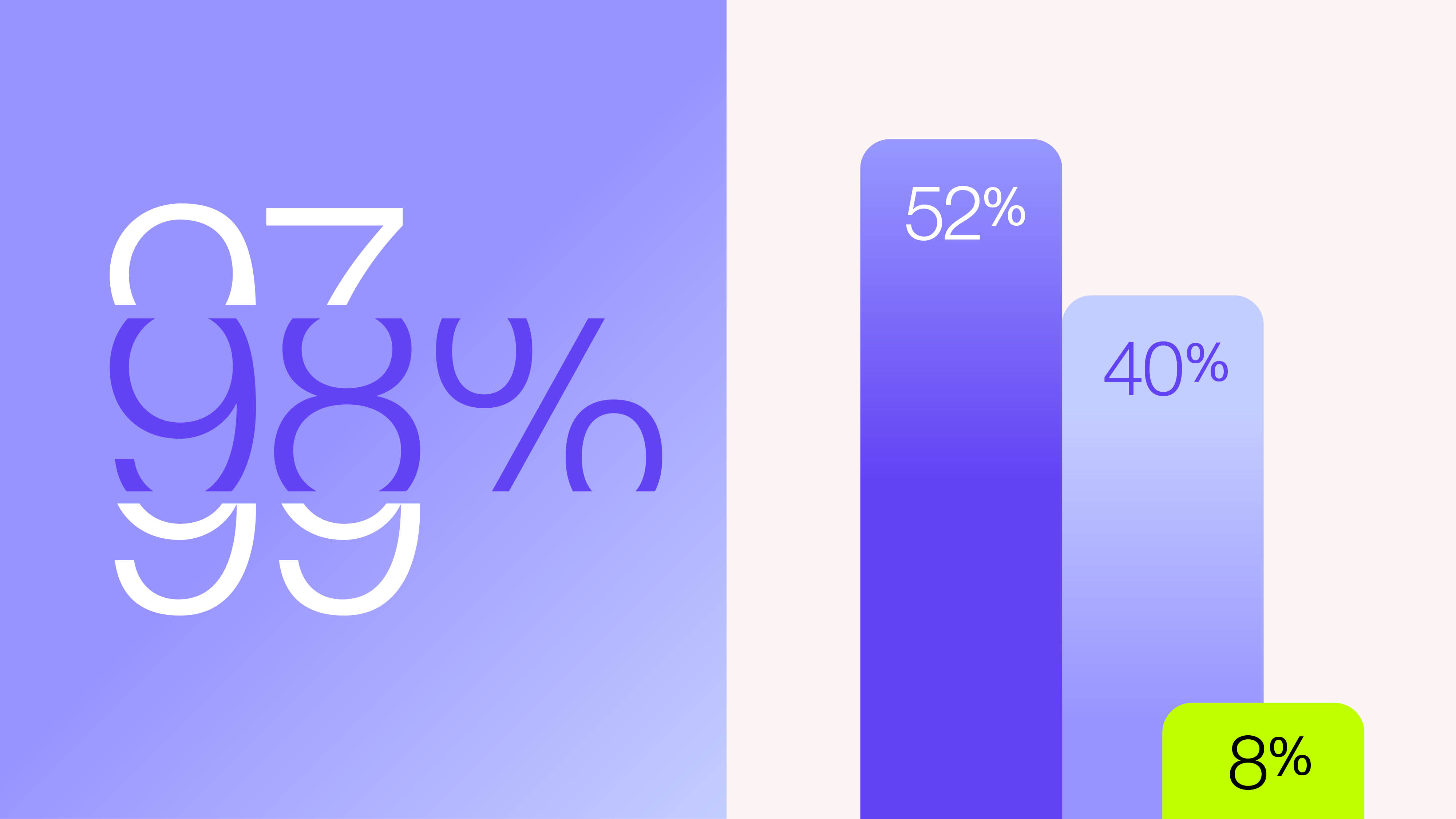
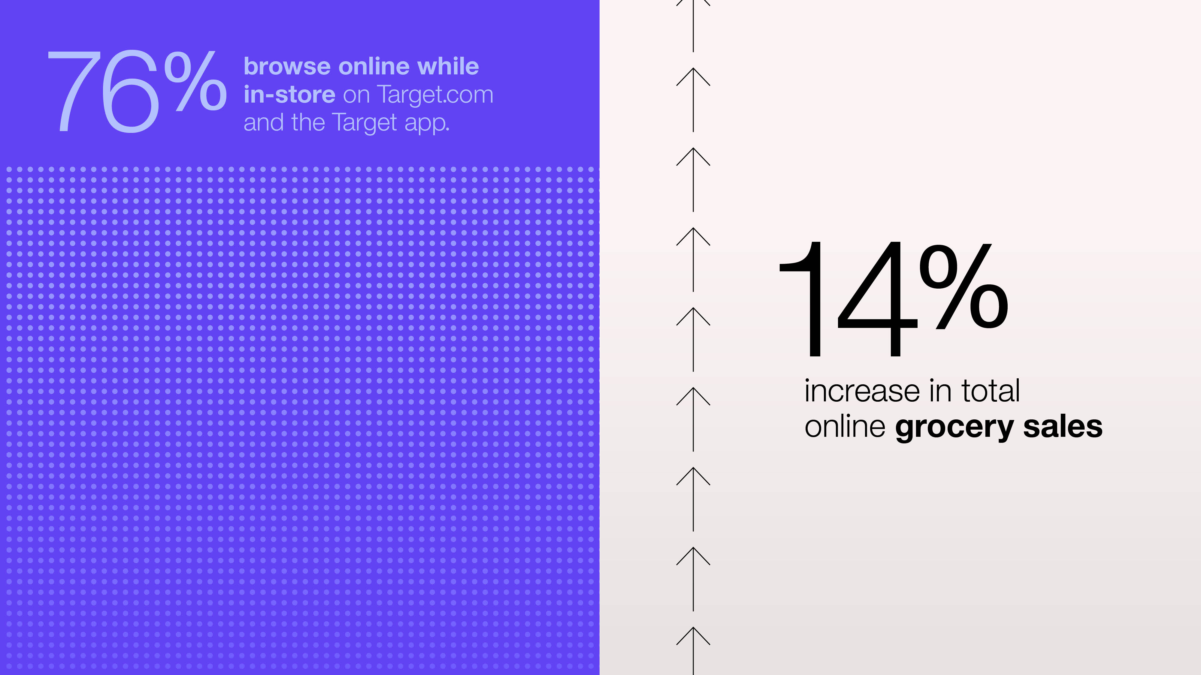
We developed a new
library of data visualization devices
to bring intruiging insights and impressive results to life.
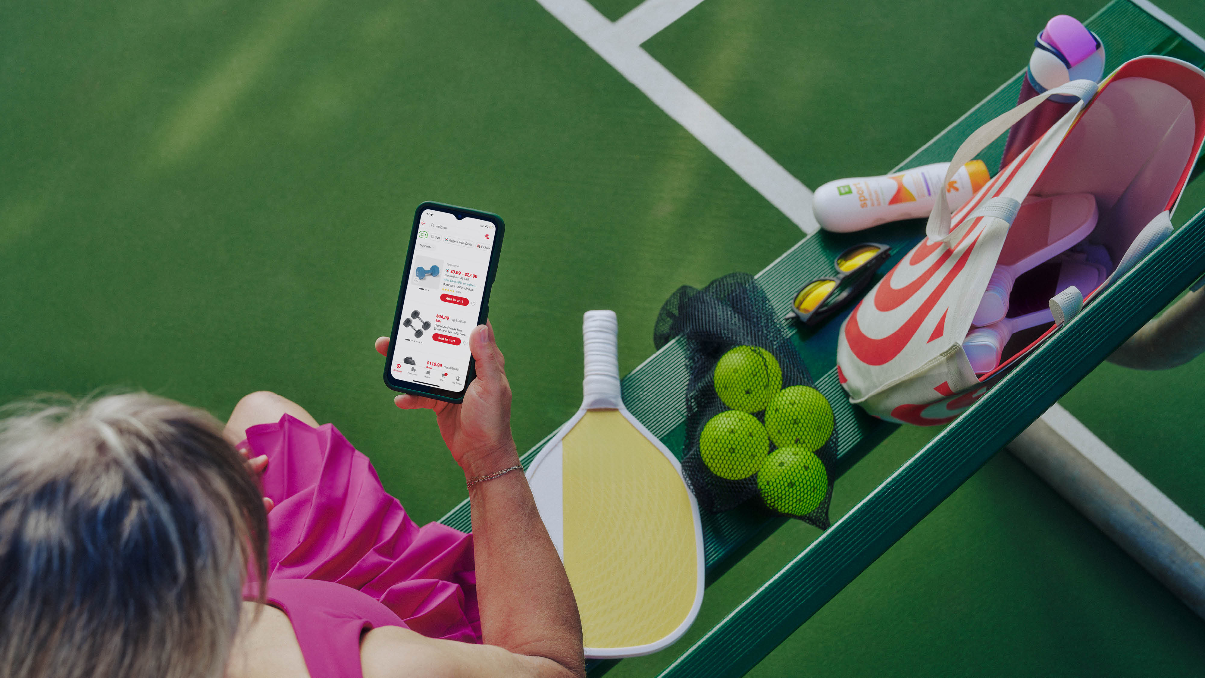

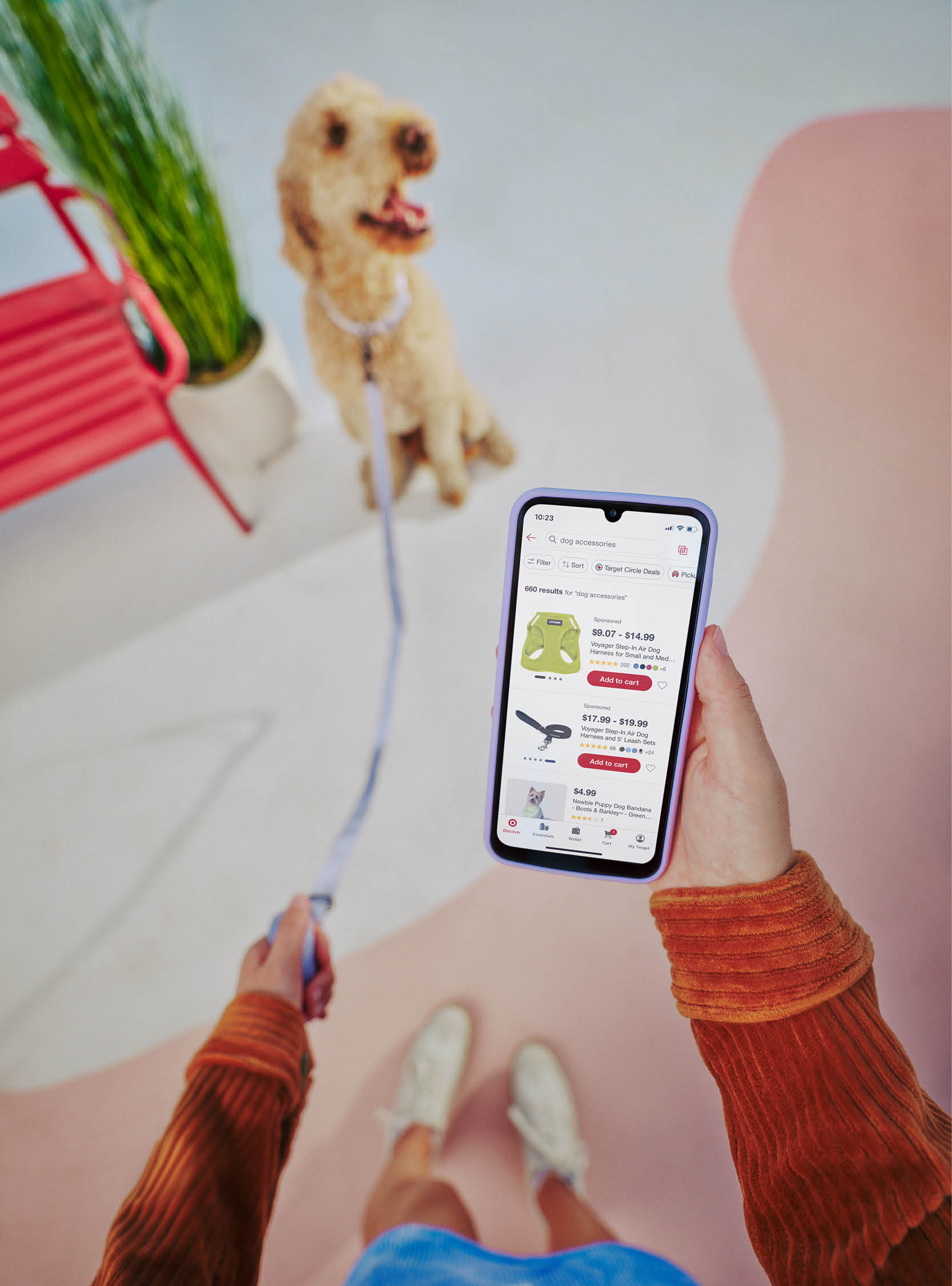
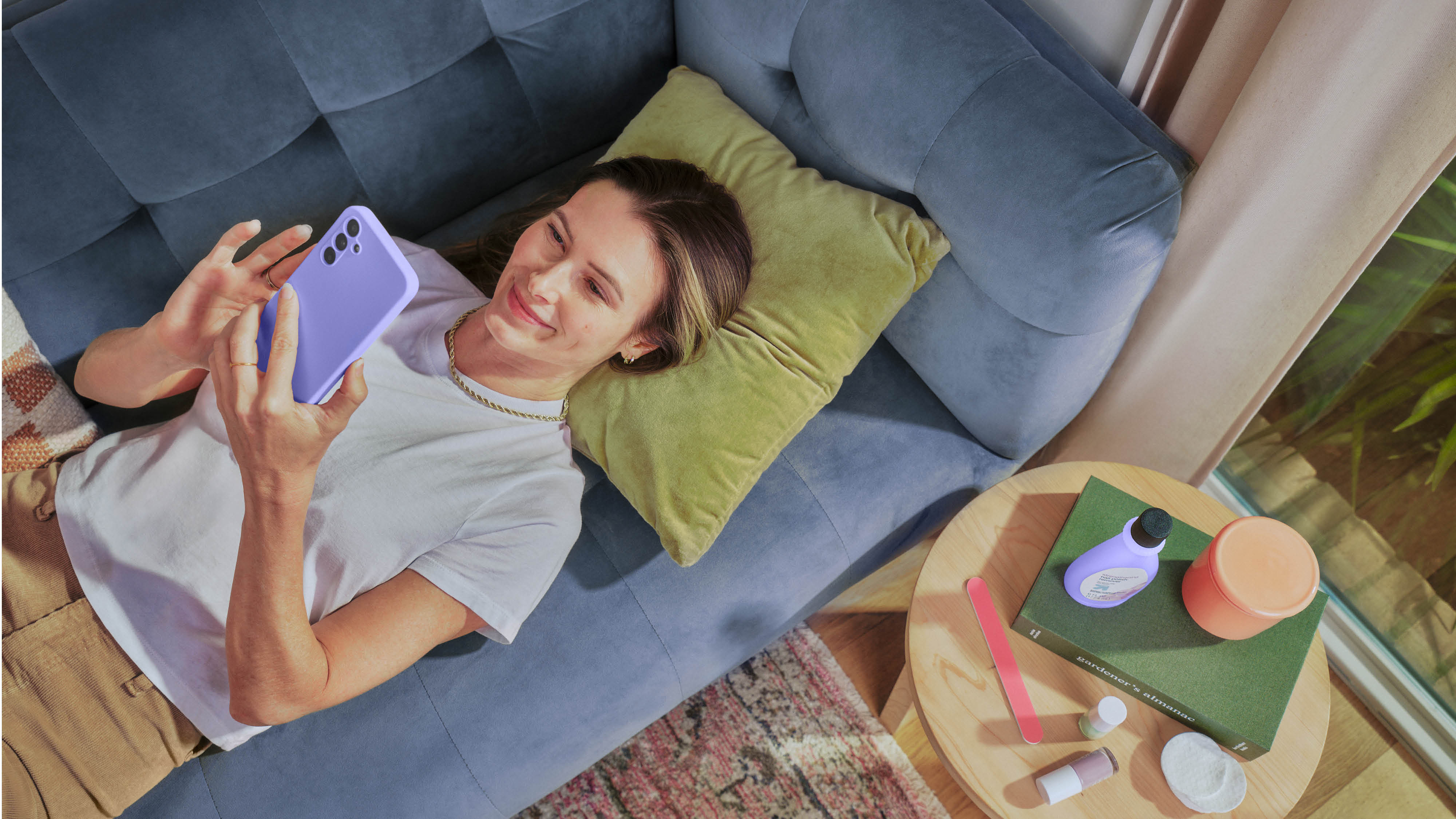
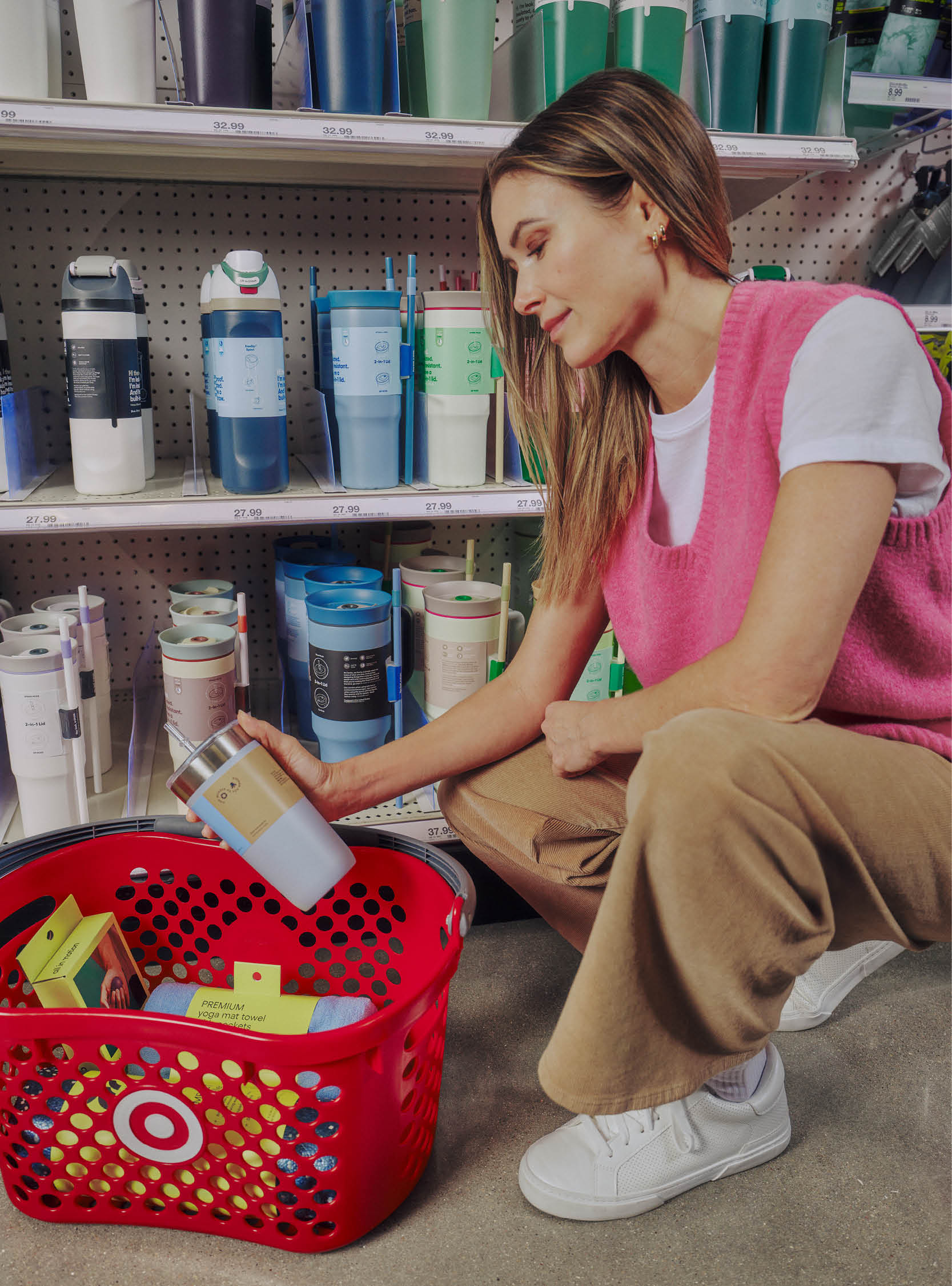

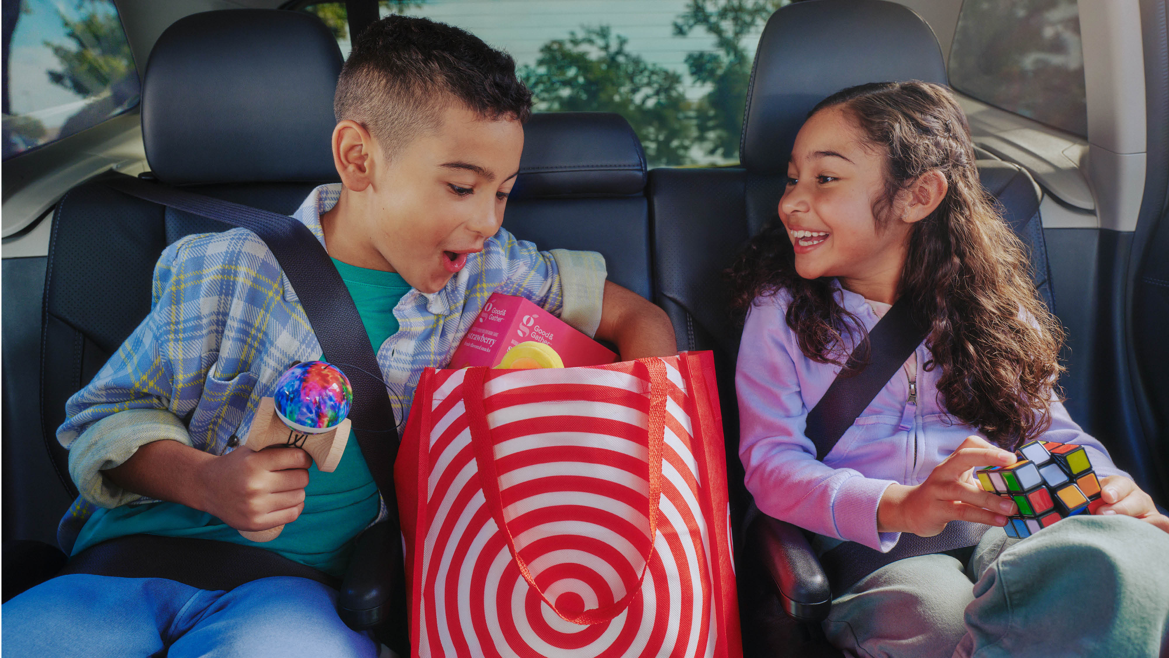
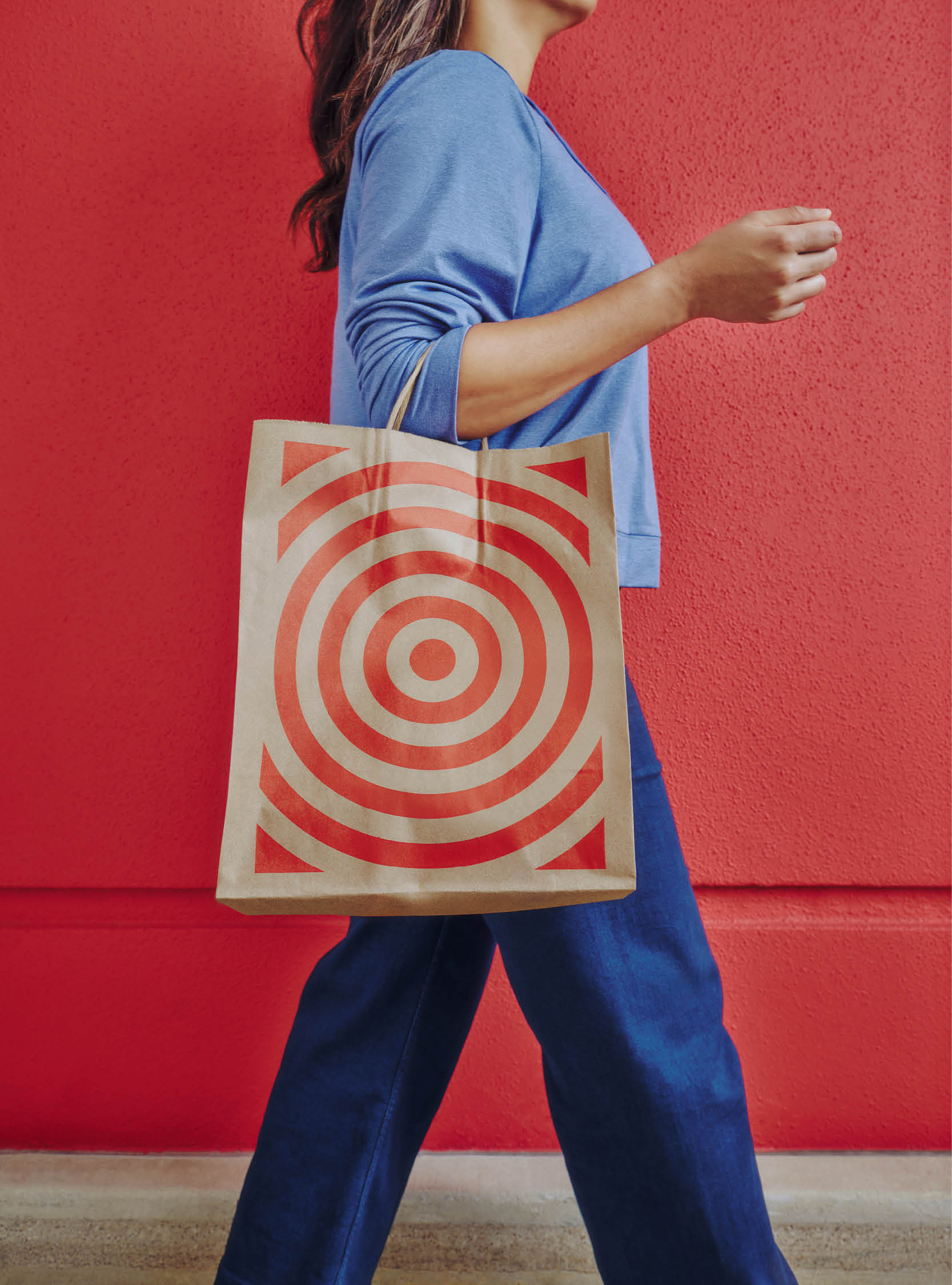
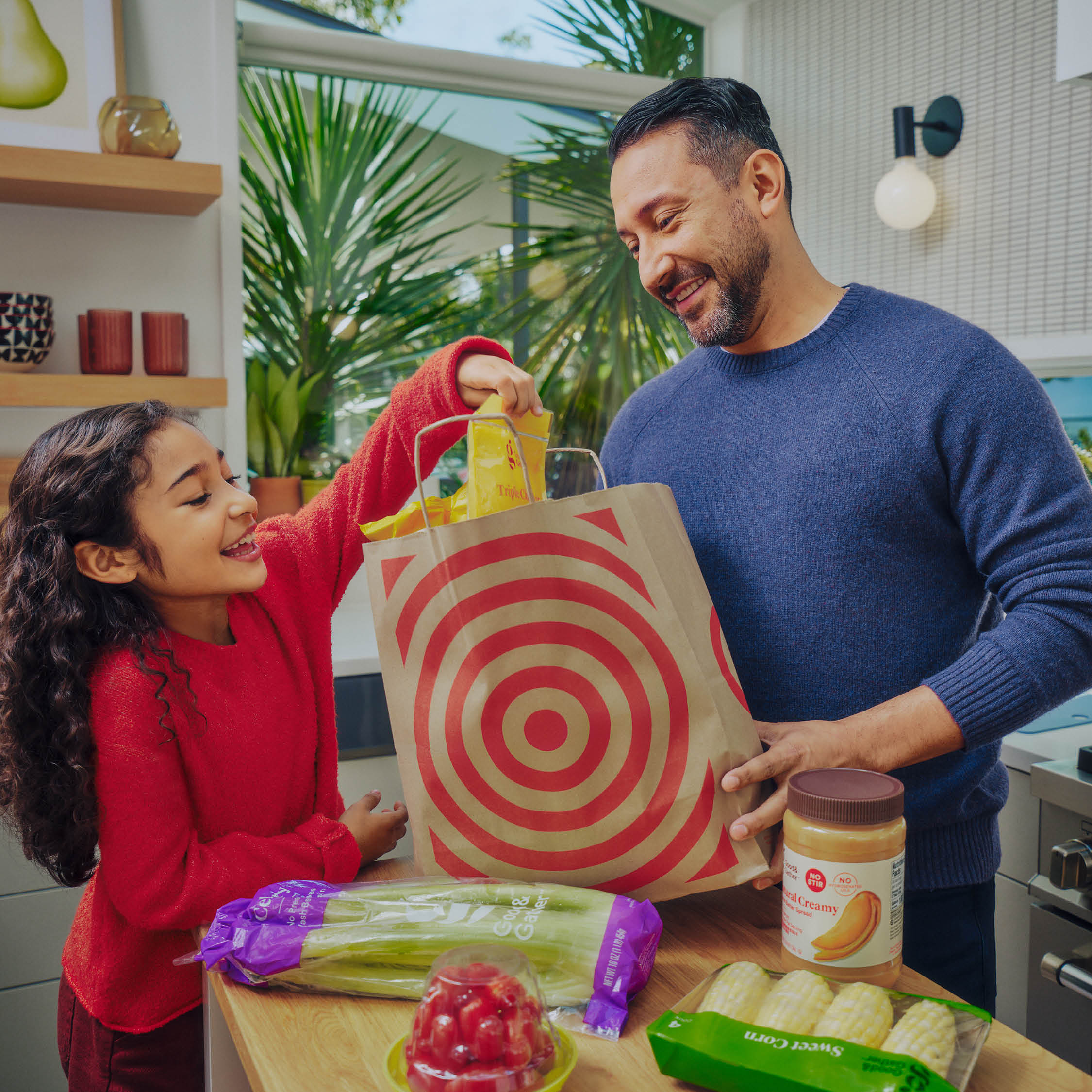

The brand’s first photography library features Target
guests interacting with media solutions, moments of discovery and splurging in-store, and the
happiness that follows from those purchases. We also captured our media professionals
experiencing the joy of seeing their Roundel campaigns performing well.
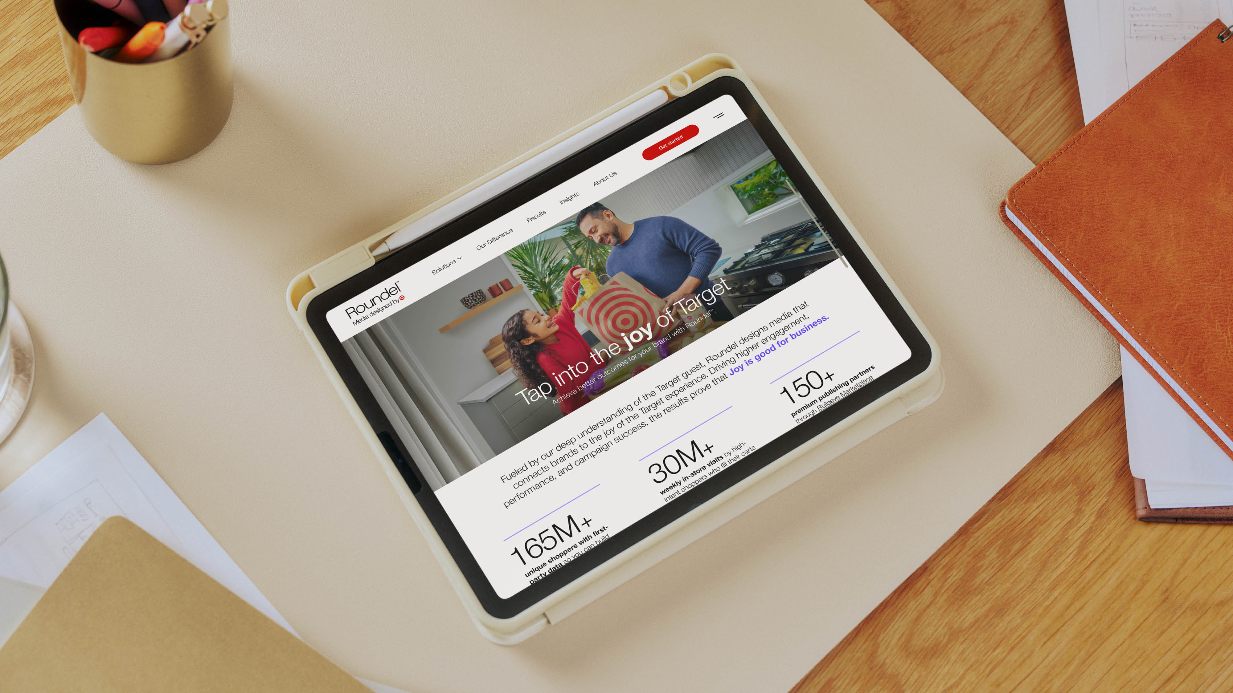
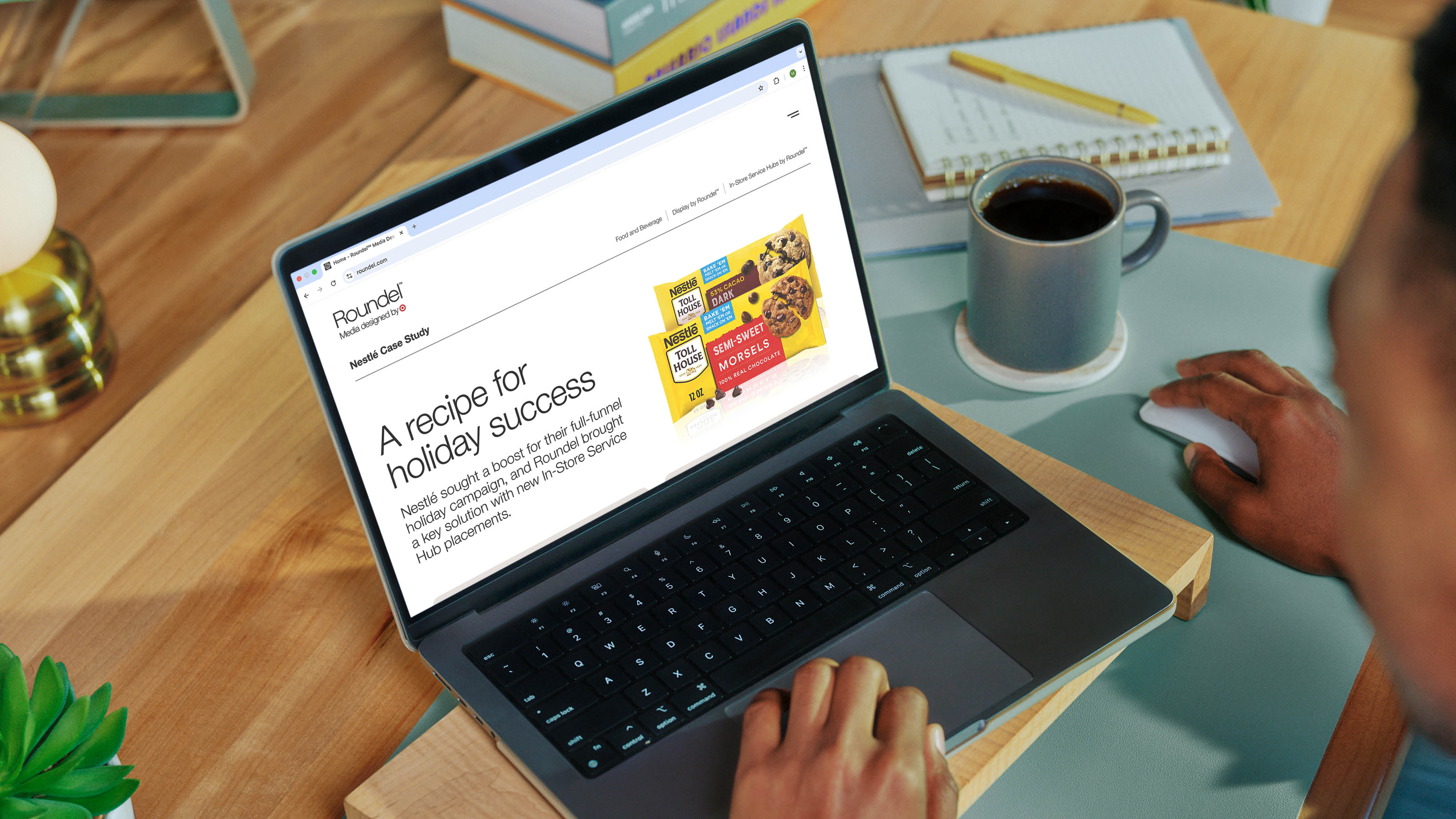
The redesigned website creates a clear story of who Roundel is and what it offers media buyers, including cleaner UI elements that celebrate results and promote lead generation.
“The Joy is good for business campaign is a welcomed improvement to our messaging to help potential clients better understand Roundel’s value proposition. It has garnered a lot of excitement internally.”
–Director of Marketing, Roundel
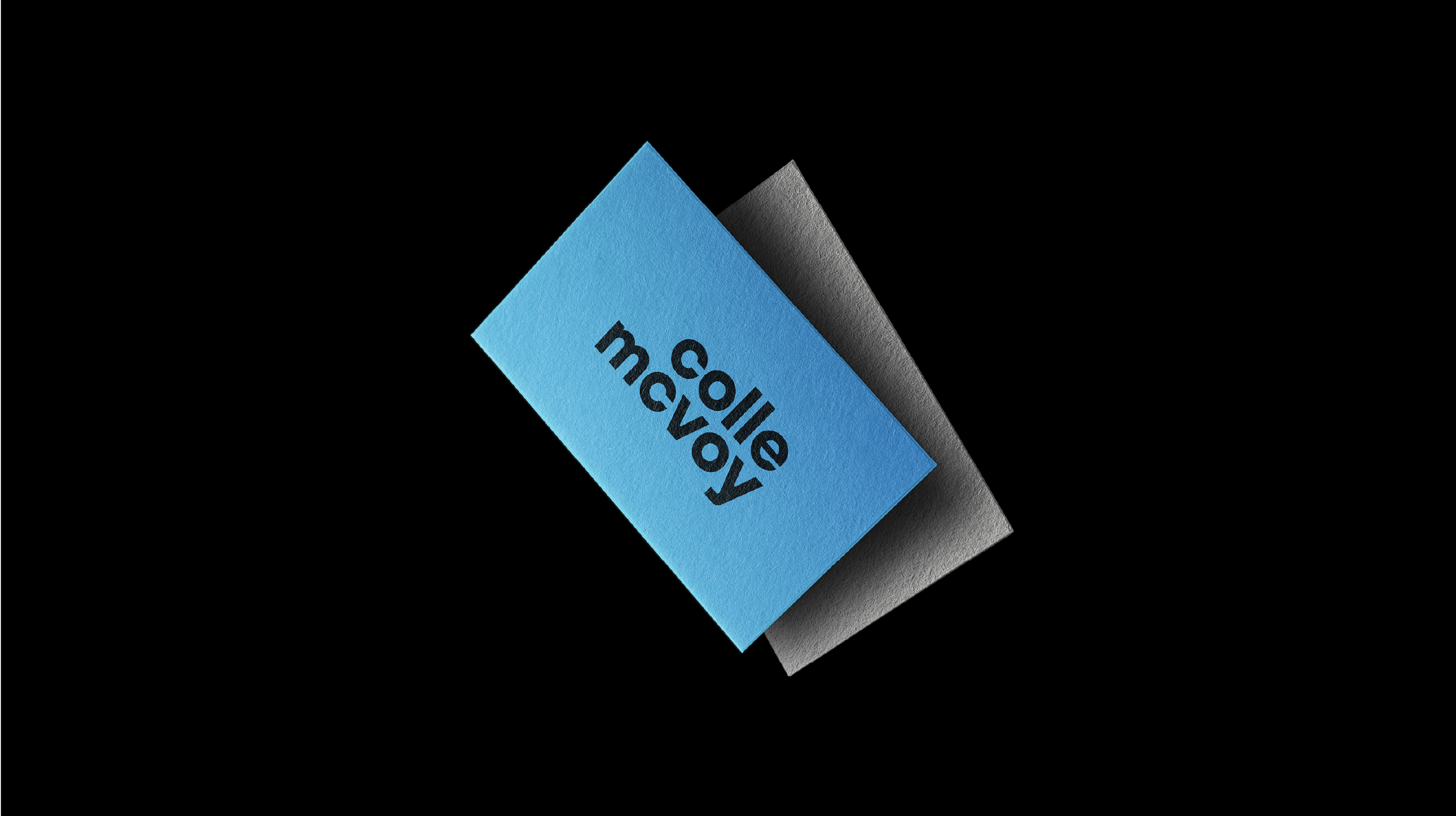
Colle McVoy
Brand Identity
As Colle McVoy found itself in the next great era of brand building, the agency felt the call to reimagine its future. Guided by a fearless positioning focused on the Great Wide Open, we built a fresh identity to showcase how the agency pushes the boundaries of creativity.
Design Director: Dustin Yerks
Senior Designer: Catherine Bretheim
Executive Creative Director: Gil Muiños
Photography: Chris Peters
Retouching: Phil Kjelland
3D Artist: Larry Phiravanh
Motion Designer: Nate Miller
Senior Designer: Catherine Bretheim
Executive Creative Director: Gil Muiños
Photography: Chris Peters
Retouching: Phil Kjelland
3D Artist: Larry Phiravanh
Motion Designer: Nate Miller
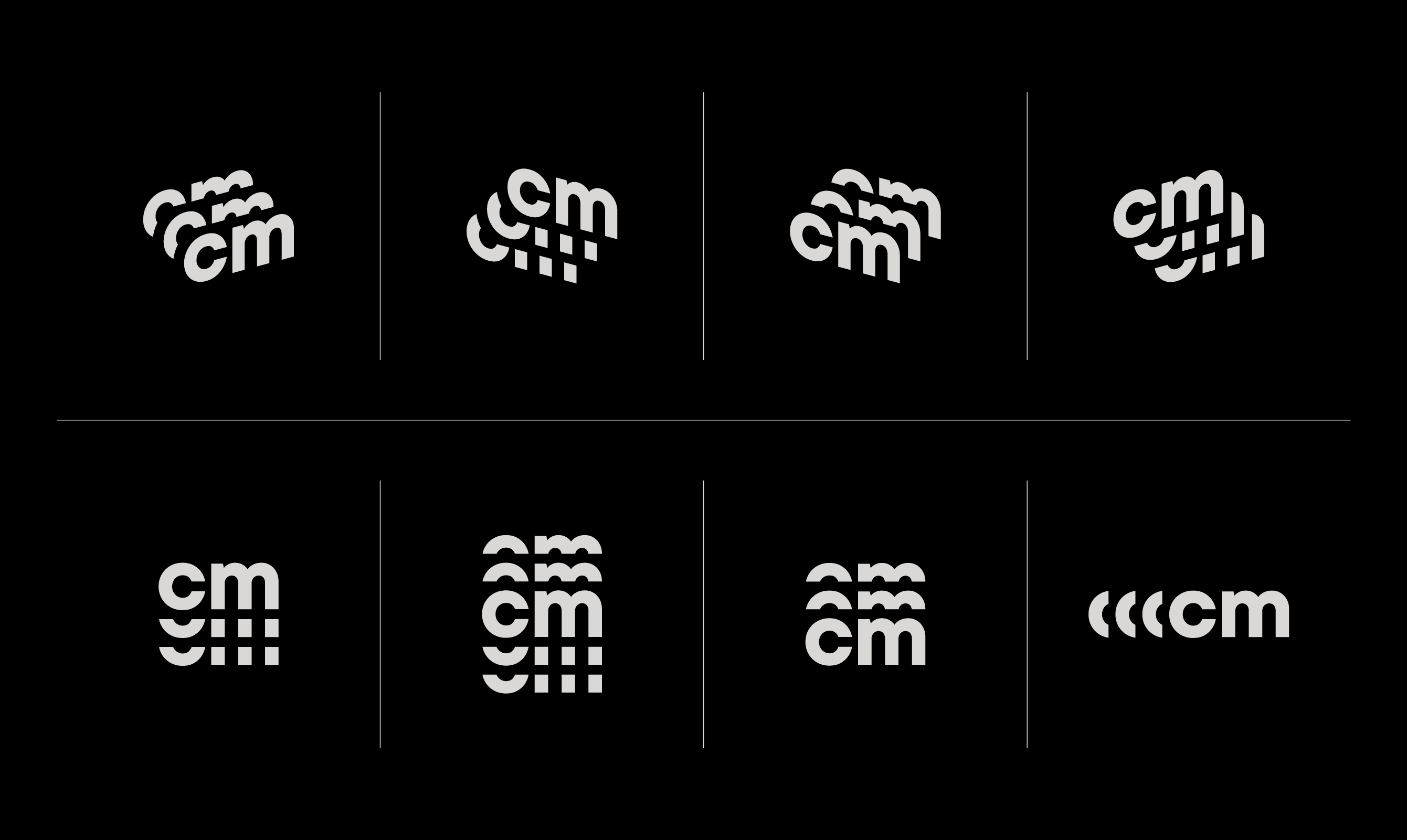
A variable system of monograms represents how the agency nimbly collaborates and iterates throughout the creative process.


A series of custom 3D landscapes represent the vastness of the Great Wide Open.

Bold flash photography represents the light the agency’s employees shine into the great wide open, leading clients forward.


Yelloh
Brand Identity, Art Direction, Web Design
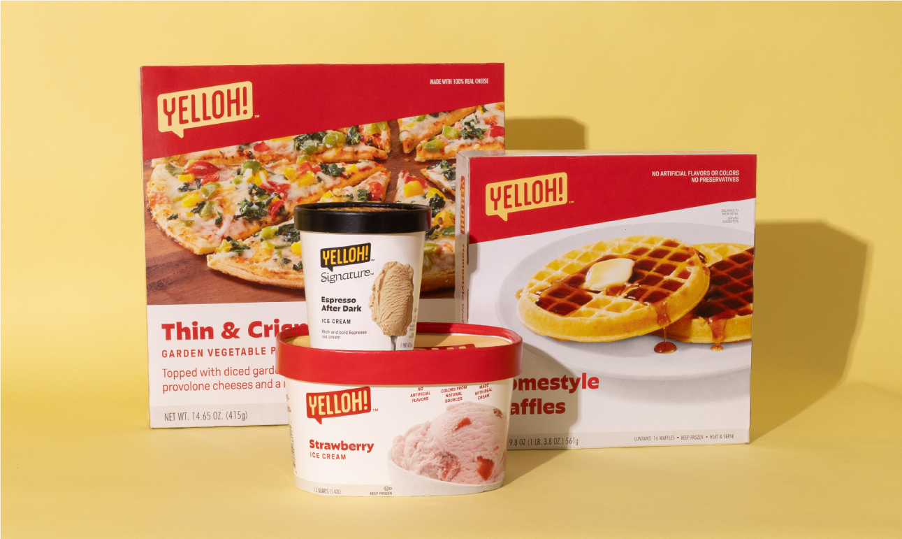
We embarked on a delicious transformation, breathing new life into a seasoned 70-year-old frozen food delivery company. We not only unveiled a fresh brand but also gave it a distinct new name and identity that nods to the company’s unique history. We designed the brand to be more relevant to the demands of today’s families, highlighting Yelloh’s mouthwatering offerings and personalized service—bringing a freezer full of happy to every doorstep.
Agency: Colle McVoy
Senior Designer: Catherine Bretheim
Design Director: Dustin Hackwith
Packaging Design: Paul Hudachek
Creative Director: Adam Ridgeway
Copywriter: Nicole Brennan
Motion Designer: Dawn Charbonneau
Photographers: Josh Grubbs, Colleen Guenther, TKP Studios
Illustrator: Jordon Cheung
Senior Designer: Catherine Bretheim
Design Director: Dustin Hackwith
Packaging Design: Paul Hudachek
Creative Director: Adam Ridgeway
Copywriter: Nicole Brennan
Motion Designer: Dawn Charbonneau
Photographers: Josh Grubbs, Colleen Guenther, TKP Studios
Illustrator: Jordon Cheung


As the original frozen food company since 1952, Schwan’s Home Delivery needed a new image to align with their new, modern offering. They entrusted us to not only rebrand, but rename their beloved, family-owned company. People familiar with Schwan’s Home Delivery often refer to it with a nostalgic glimmer; we aimed to bring the brand to the present, while positioning it to create memories for a new generation of consumer.

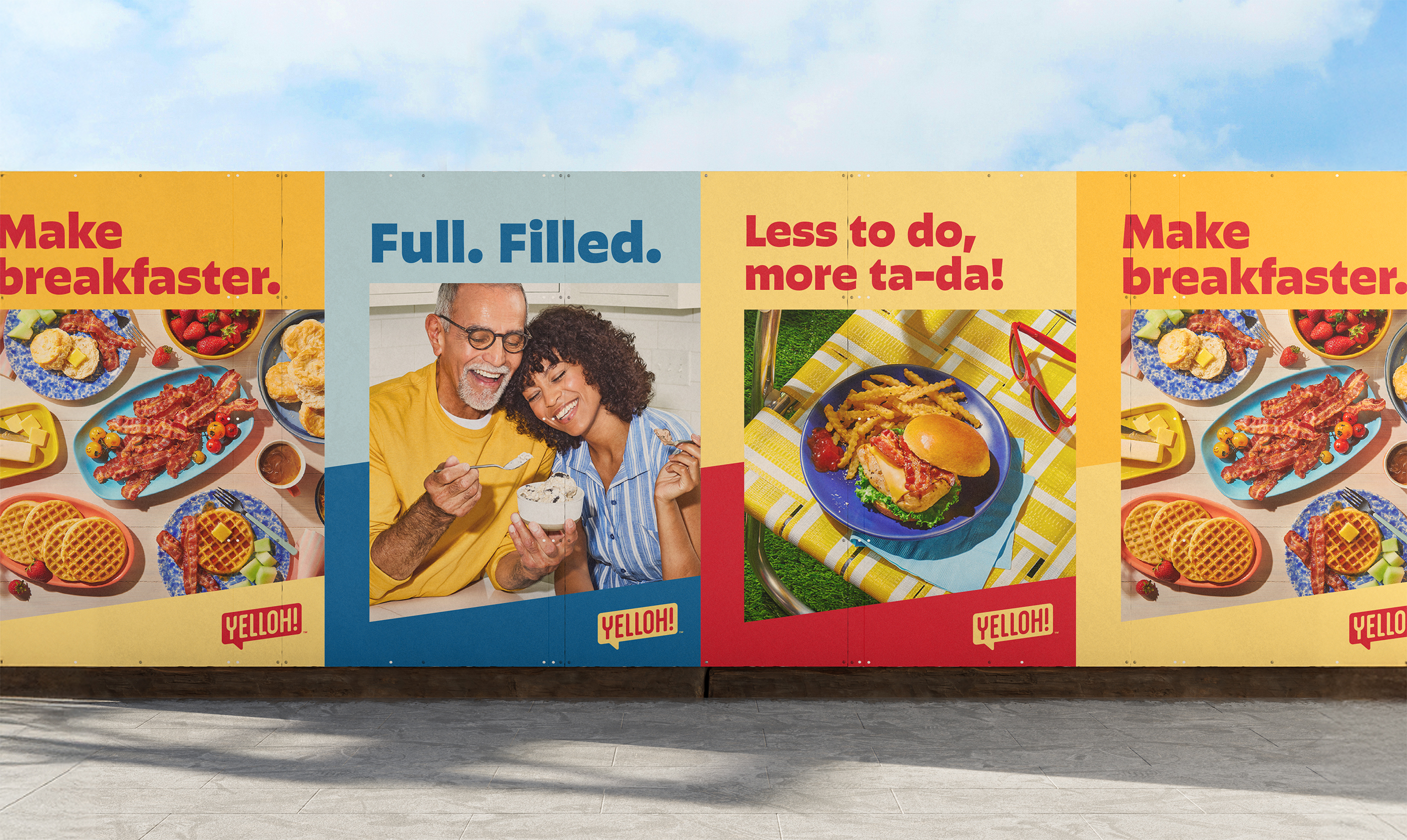
Why the name Yelloh? It’s a friendly greeting, the color of their iconic trucks, and now, it’s a great way to get a freezer full of happy.
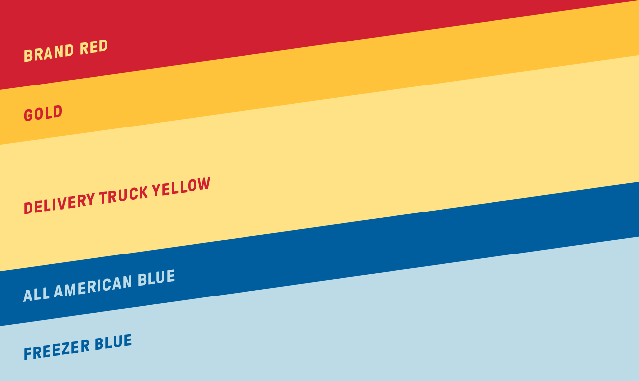
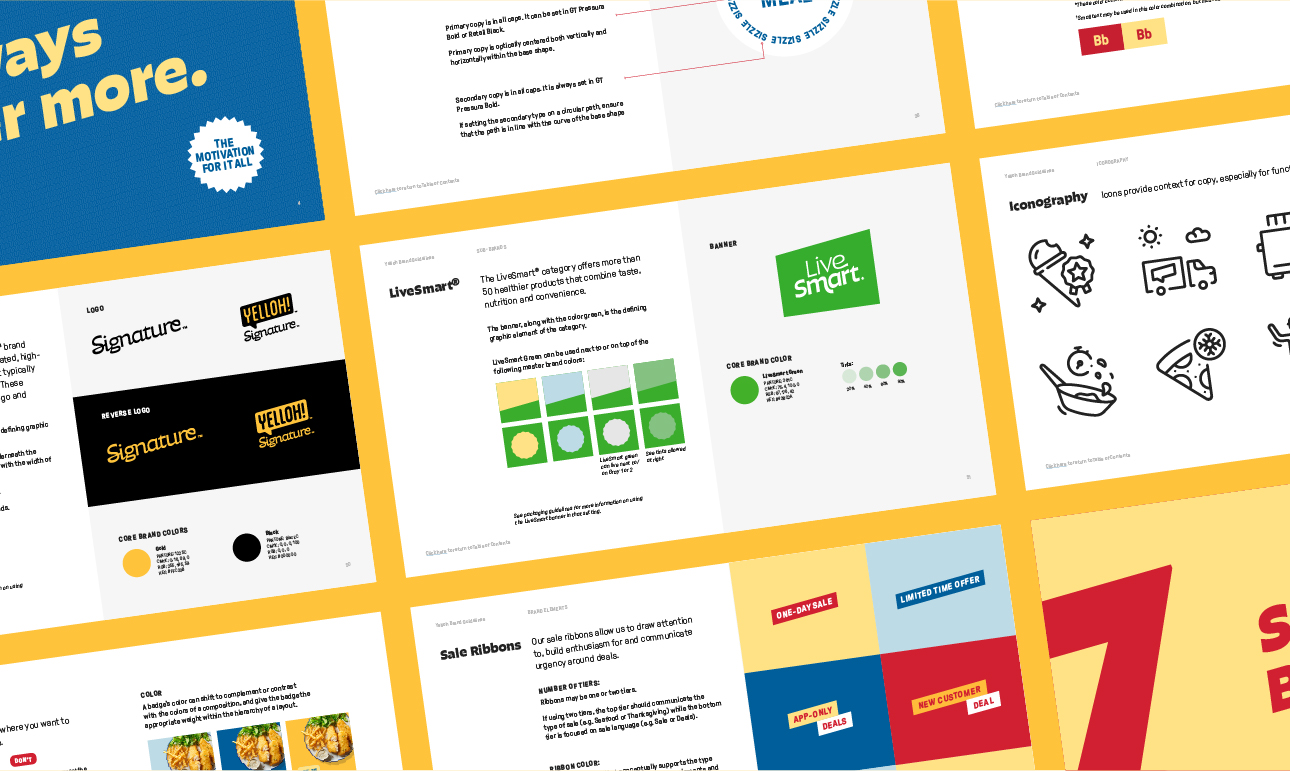
The color palette pulls forward hues from the original brand while refreshing others to give Yelloh a modern feel. Angled blocks stemming from the logo are a core component of the graphic language and create dynamic layouts with a sense of movement — expressing how the brand efficiently delivers food to customers’ doorsteps.

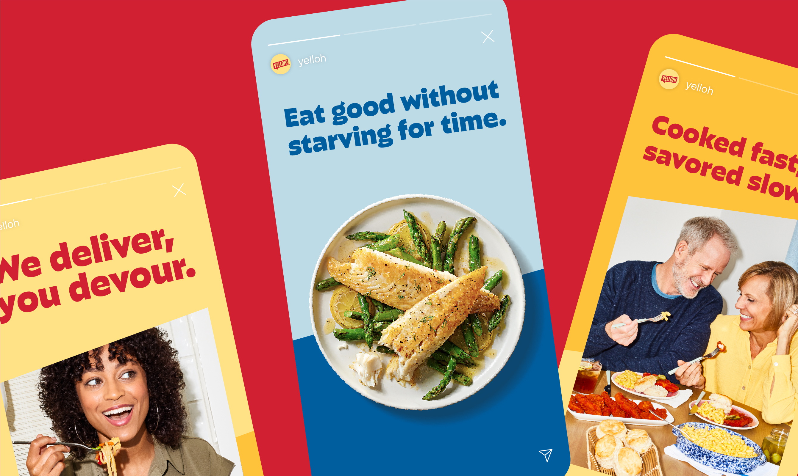
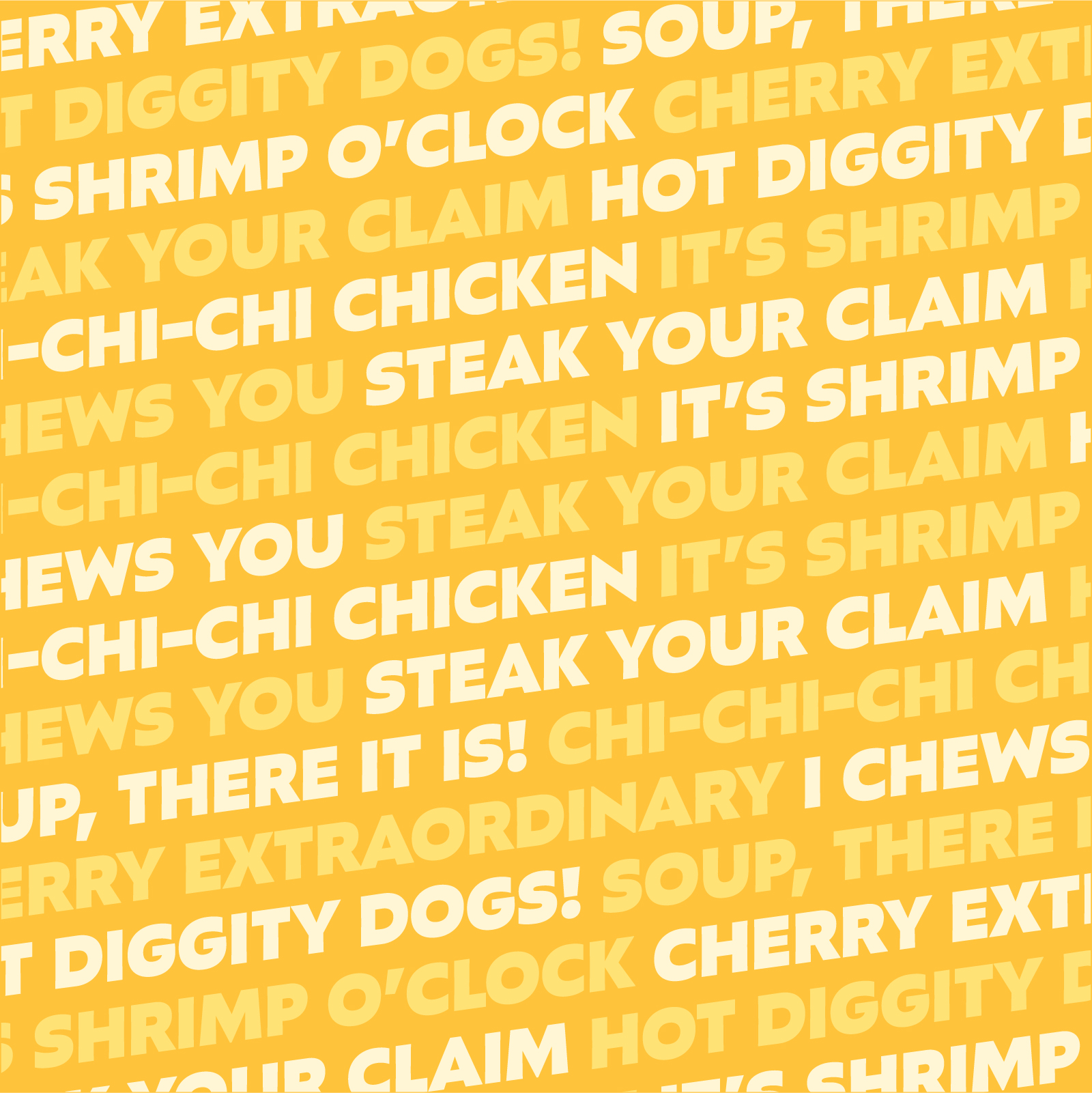
Typography is playful and bold — the perfect vessel for the brand’s revamped tone: fun, relatable, enthusiastic and knowledgeable.


The identity came to life in some of the brand’s most iconic assets including its legendary yellow delivery trucks, driver uniforms, freezer bags and packaging.

A system of badges highlights product offerings and the expertise drivers bring to customers' doorsteps.


We developed the brand’s first illustration library to tell new customers the story of how Yelloh delivers a freezer full of happy.


The food and lifestyle photography reflects relatable mealtime moments, complete with modern lighting style, refreshed prop library, and food styling that embraces life’s delicious imperfections.


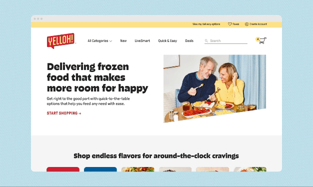
Yelloh.com is a modern leap for the original frozen food company.


“From the first naming ideas to the final logo, there was so much collaboration and spirited discussion…thank you for your thoughtful creative and strategy leadership.”
–Marketing Director, Yelloh
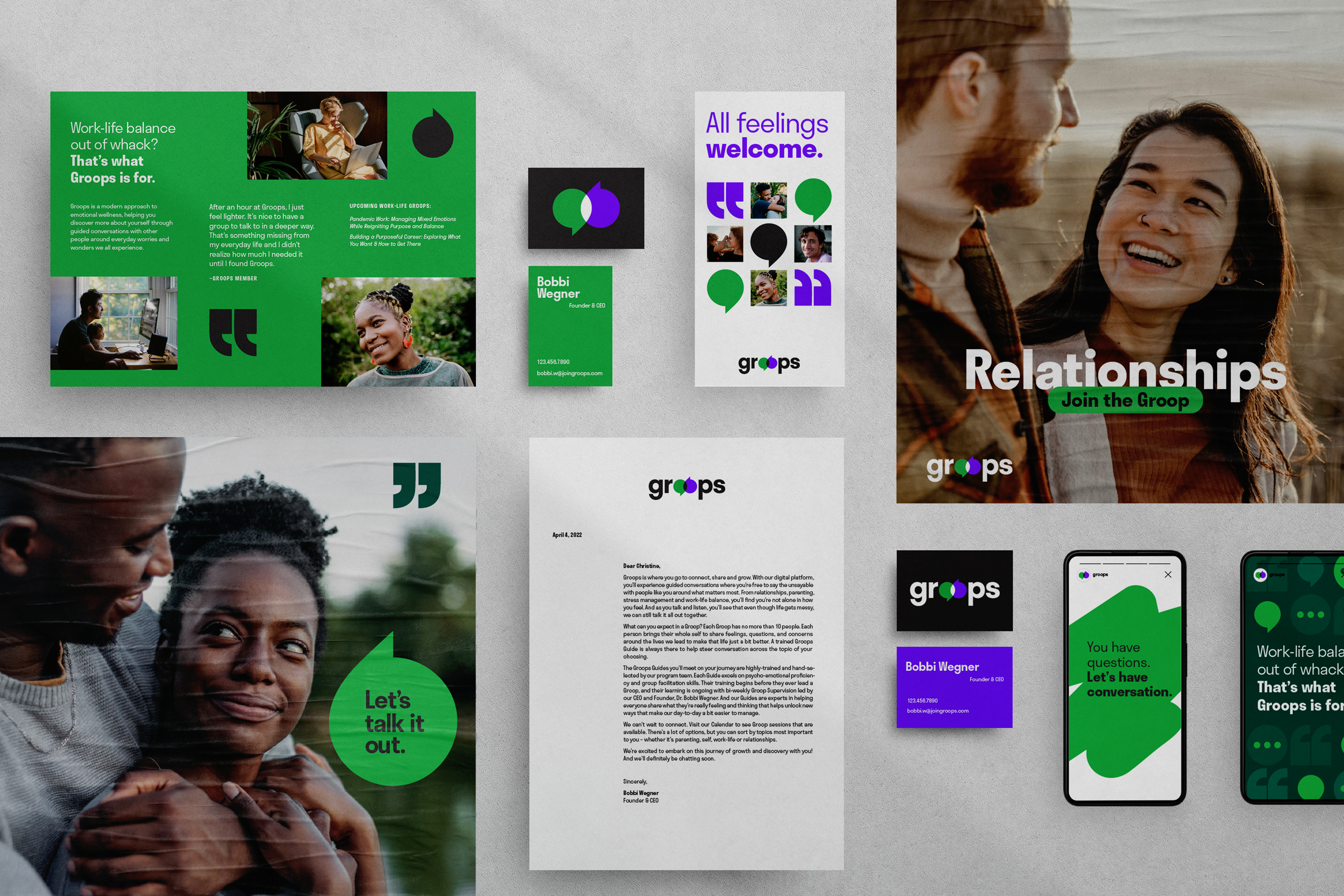
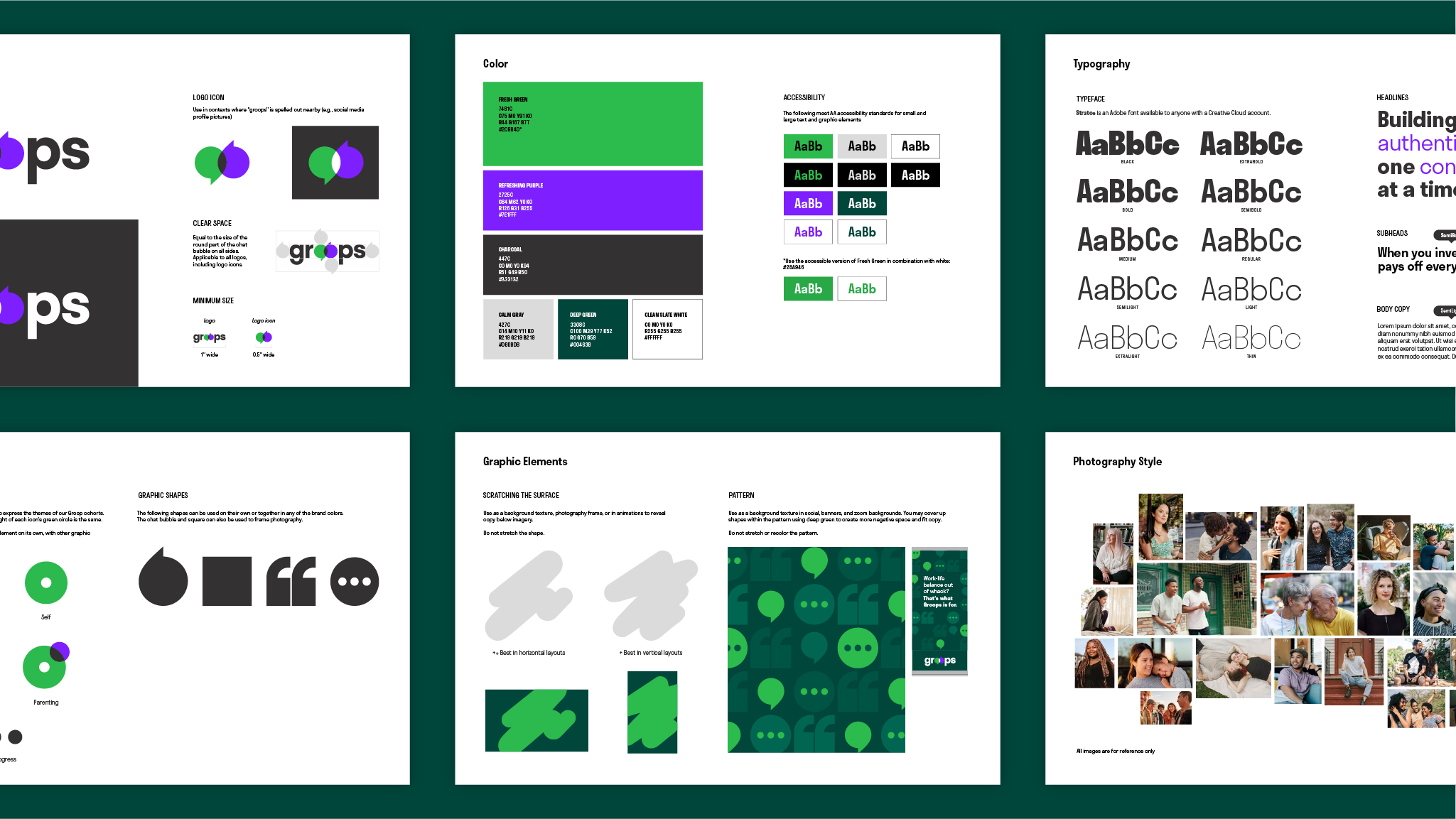
Groops
Brand Identity
Groops is a mental wellness platform that gives people a space to talk about life’s biggest issues. The brand identity was designed to reflect the brand’s modern approach to mental wellness while highlighting the bold and illuminating conversations members have through Groops.
Agency: Colle McVoy for Groops
Designer: Catherine Bretheim
Digital Designer: Sam Gordon
Design Director: Diana Quenomoen
Strategist: Casie Cook
Copywriter/ACD: Zach DeBlaey
Designer: Catherine Bretheim
Digital Designer: Sam Gordon
Design Director: Diana Quenomoen
Strategist: Casie Cook
Copywriter/ACD: Zach DeBlaey
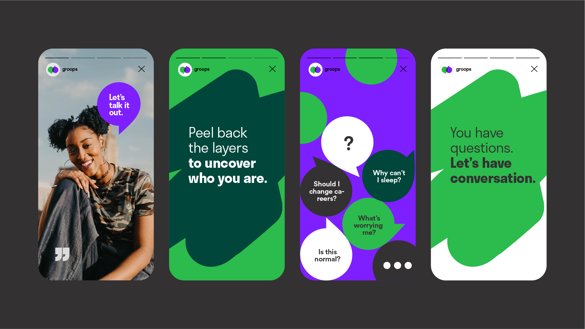
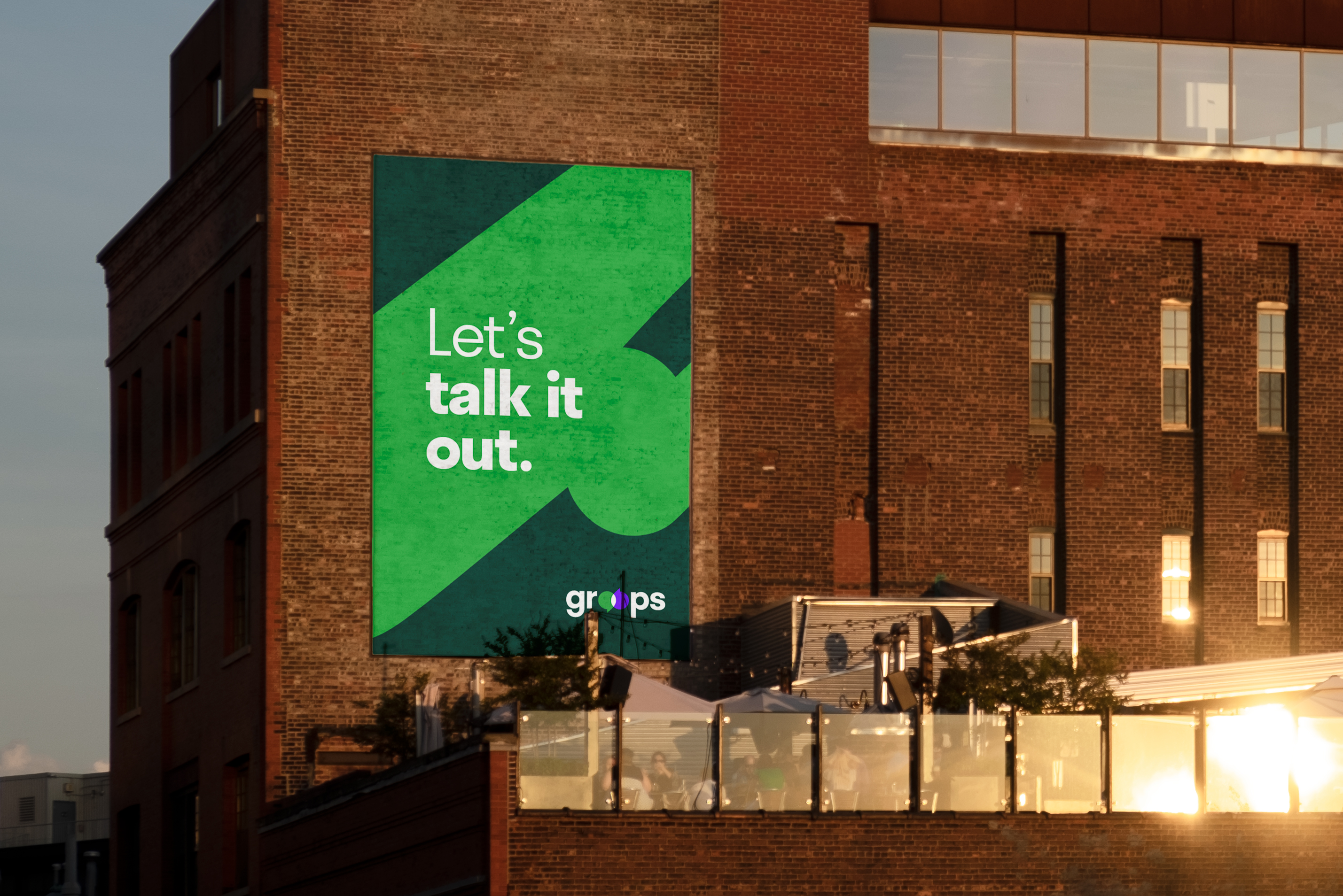
The logo transforms Groops’ “O’s” into overlapping speech bubbles to highlight the power of conversation.
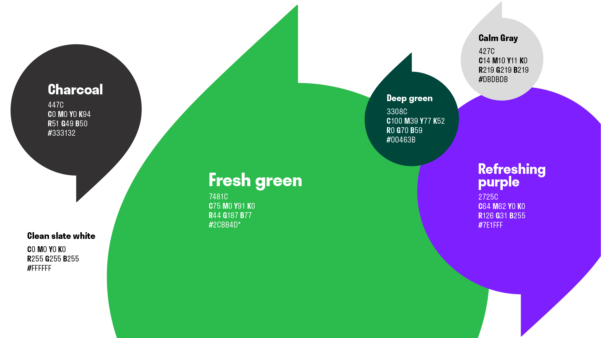
Our bright and refreshing color palette stands apart from the competition's subdued hues and conveys the raw candor that Groops encourages in their virtual conversations.
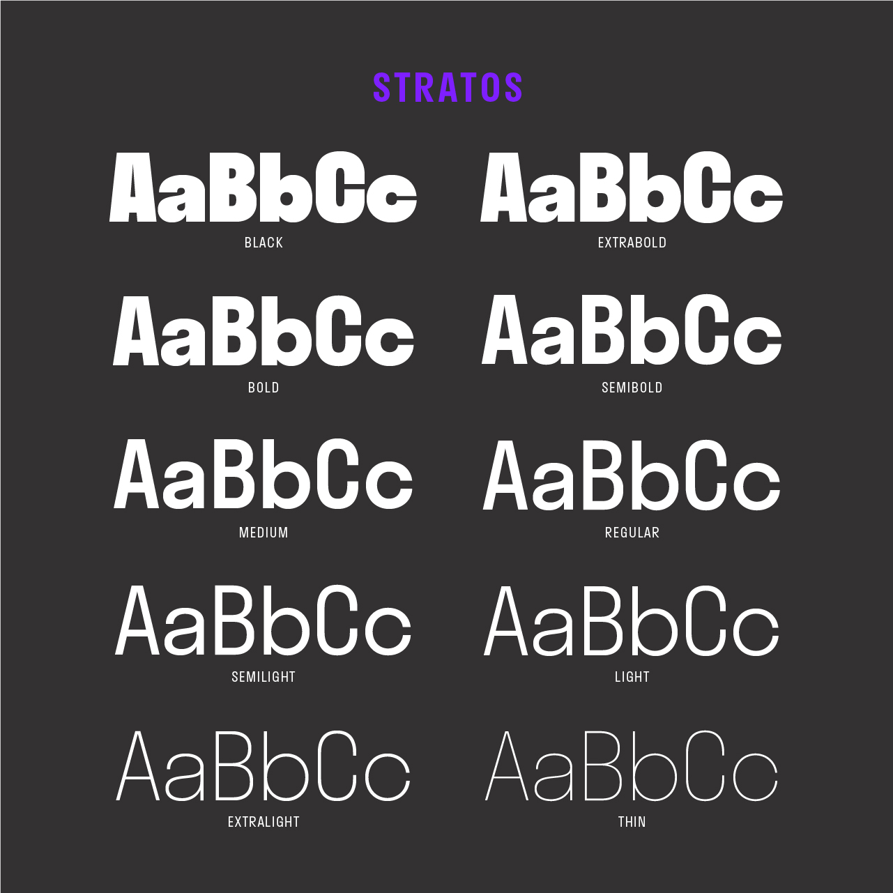 The brand system utilizes a typeface with various weights and narrow letterforms that allow for a strong type hierarchy system and reflect the brand's modern approach to wellness.
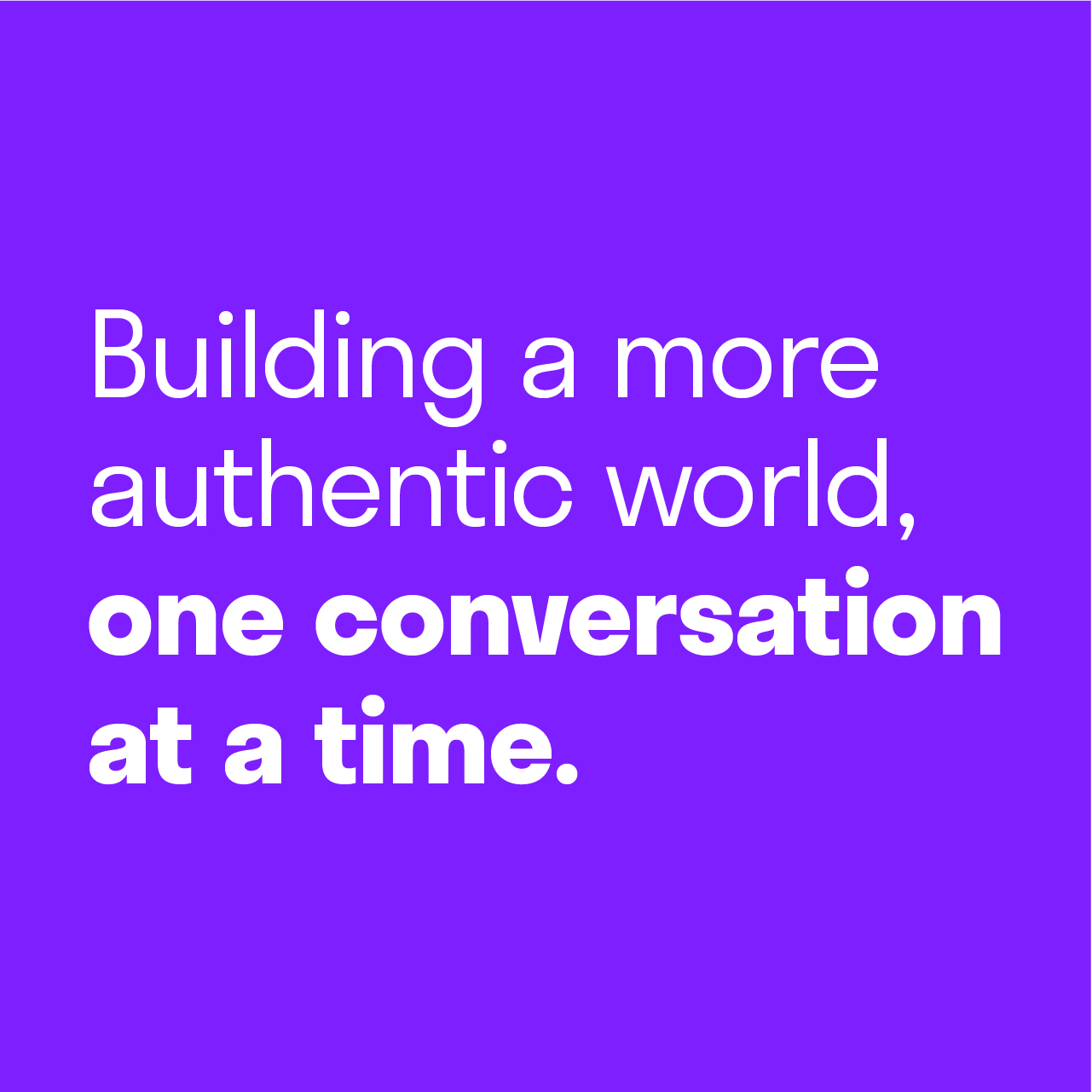
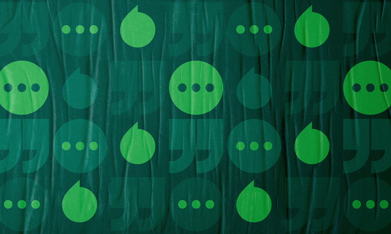
Our patterns highlight the open conversations that happen in Groops.
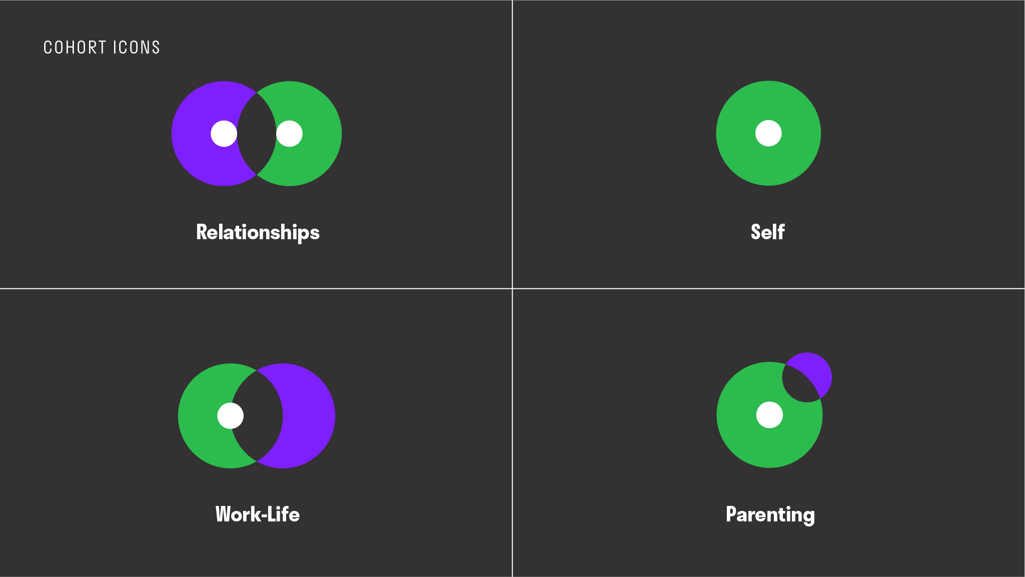 The brand’s iconography system pulls from the logo’s round shapes to embody Groops’ unique cohorts.
Our warm editorial photography style captures raw and candid moments to convey the authenticity members can expect to feel when joining Groops.
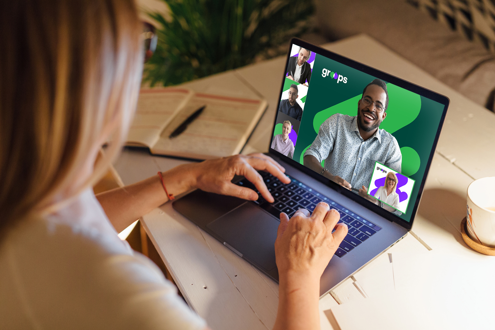
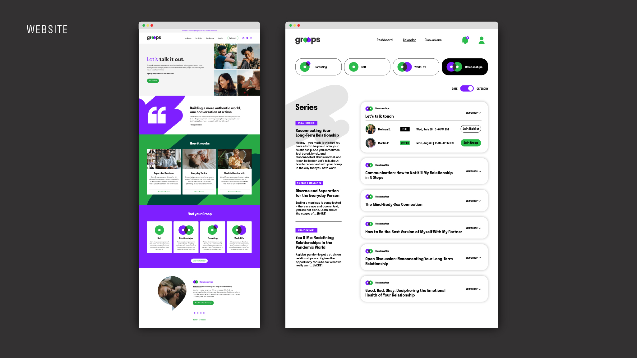
Our digital redesigns – from email, to web, to the member dashboard – greet current and future members with a refreshing, bold, and easily navigable experience.