Yelloh
Brand Identity, Art Direction, Web Design
We embarked on a delicious transformation, breathing new life into a seasoned 70-year-old frozen food delivery company. We not only unveiled a fresh brand but also gave it a distinct new name and identity that nods to the company’s unique history. We designed the brand to be more relevant to the demands of today’s families, highlighting Yelloh’s mouthwatering offerings and personalized service—bringing a freezer full of happy to every doorstep.
Agency: Colle McVoy
Senior Designer: Catherine Bretheim
Design Director: Dustin Hackwith
Packaging Design: Paul Hudachek
Creative Director: Adam Ridgeway
Copywriter: Nicole Brennan
Motion Designer: Dawn Charbonneau
Photographers: Josh Grubbs, Colleen Guenther, TKP Studios
Illustrator: Jordon Cheung
Senior Designer: Catherine Bretheim
Design Director: Dustin Hackwith
Packaging Design: Paul Hudachek
Creative Director: Adam Ridgeway
Copywriter: Nicole Brennan
Motion Designer: Dawn Charbonneau
Photographers: Josh Grubbs, Colleen Guenther, TKP Studios
Illustrator: Jordon Cheung


As the original frozen food company since 1952, Schwan’s Home Delivery needed a new image to align with their new, modern offering. They entrusted us to not only rebrand, but rename their beloved, family-owned company. People familiar with Schwan’s Home Delivery often refer to it with a nostalgic glimmer; we aimed to bring the brand to the present, while positioning it to create memories for a new generation of consumer.

Why the name Yelloh? It’s a friendly greeting, the color of their iconic trucks, and now, it’s a great way to get a freezer full of happy.
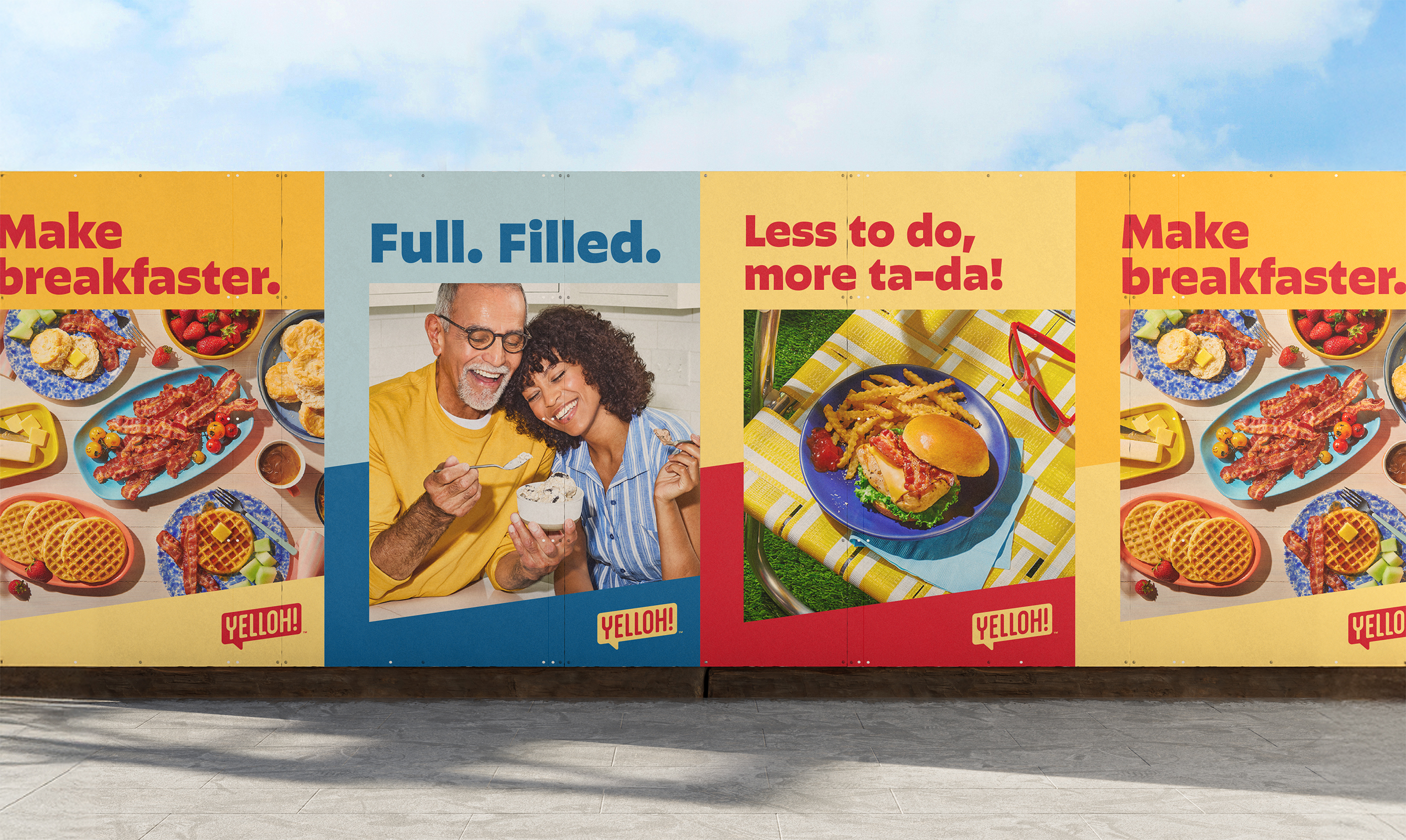
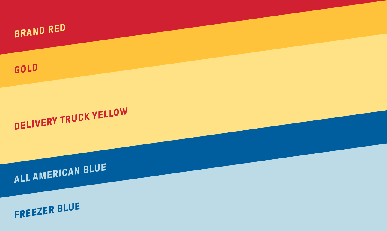
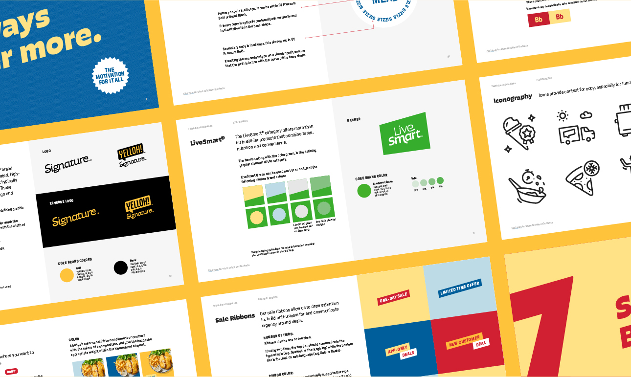
The color palette pulls forward hues from the original brand while refreshing others to give Yelloh a modern feel. Angled blocks stemming from the logo are a core component of the graphic language and create dynamic layouts with a sense of movement — expressing how the brand efficiently delivers food to customers’ doorsteps.

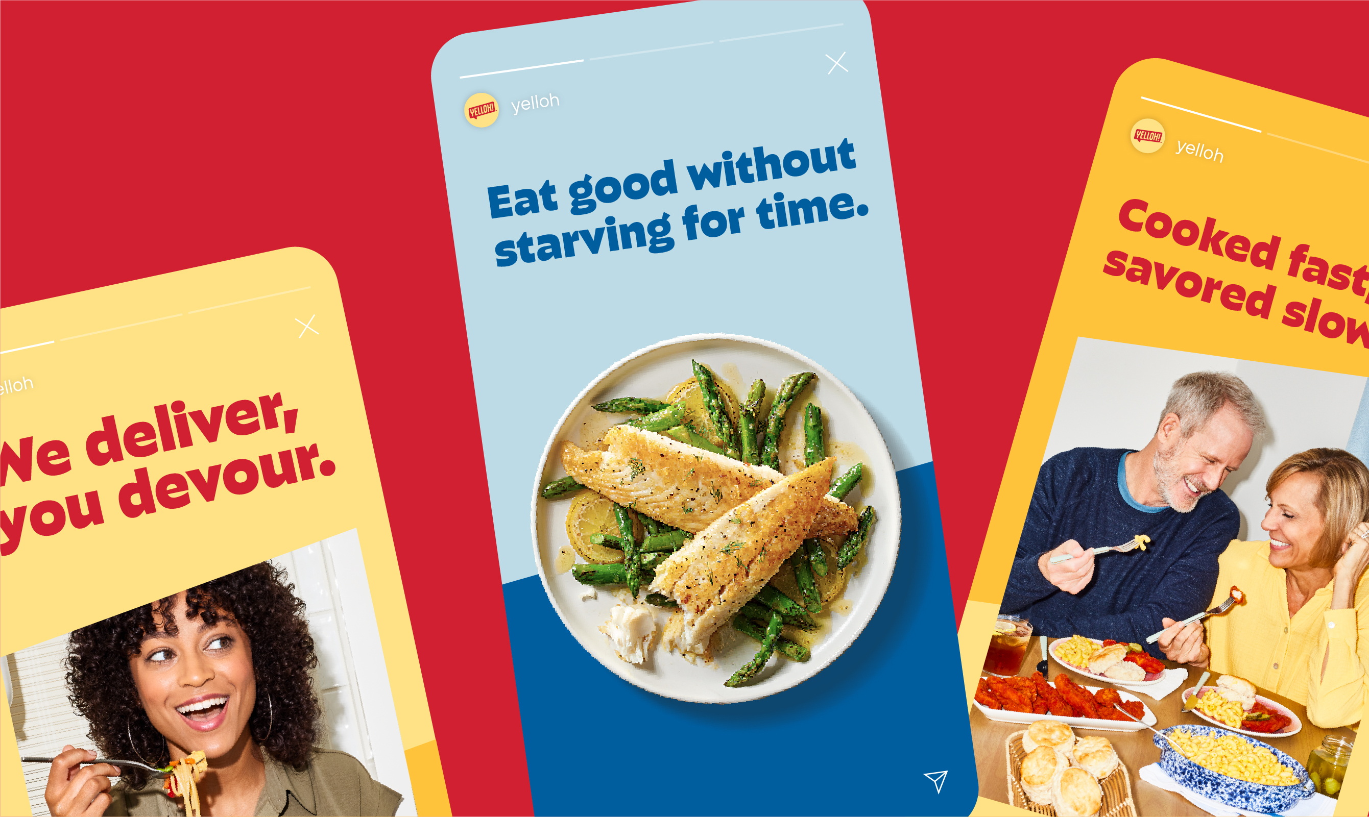
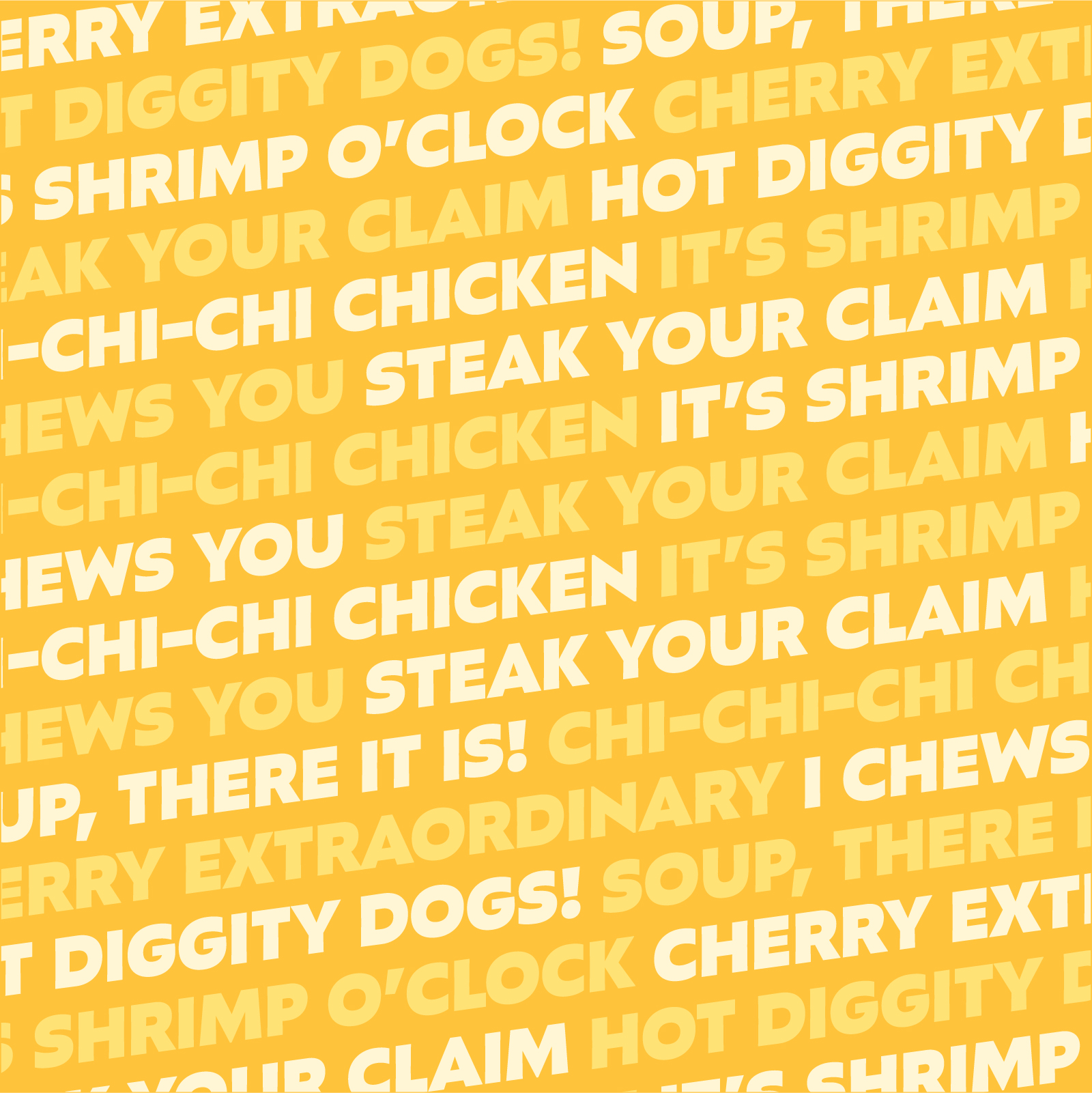
Typography is playful and bold — the perfect vessel for the brand’s revamped tone: fun, relatable, enthusiastic and knowledgeable.


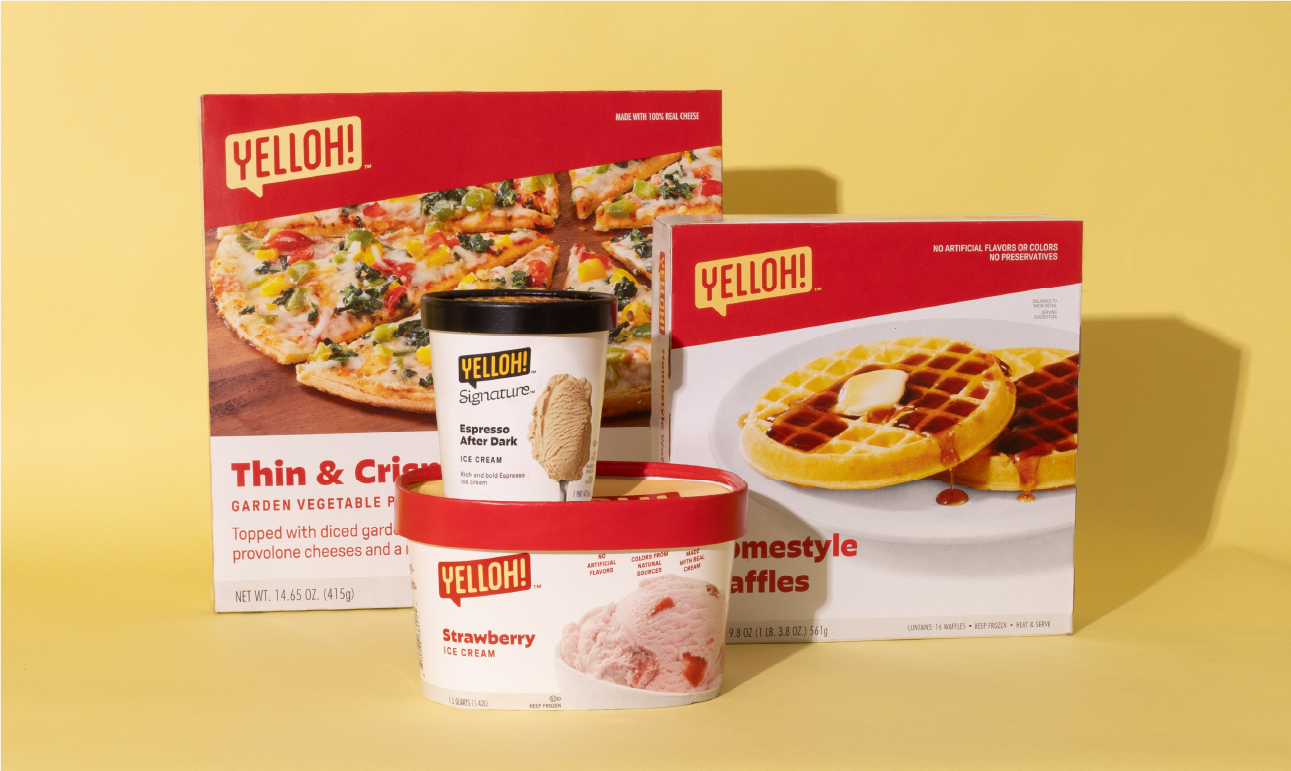
The identity came to life in some of the brand’s most iconic assets including its legendary yellow delivery trucks, driver uniforms, freezer bags and packaging.

A system of badges highlights product offerings and the expertise drivers bring to customers' doorsteps.


We developed the brand’s first illustration library to tell new customers the story of how Yelloh delivers a freezer full of happy.


The food and lifestyle photography reflects relatable mealtime moments, complete with modern lighting style, refreshed prop library, and food styling that embraces life’s delicious imperfections.


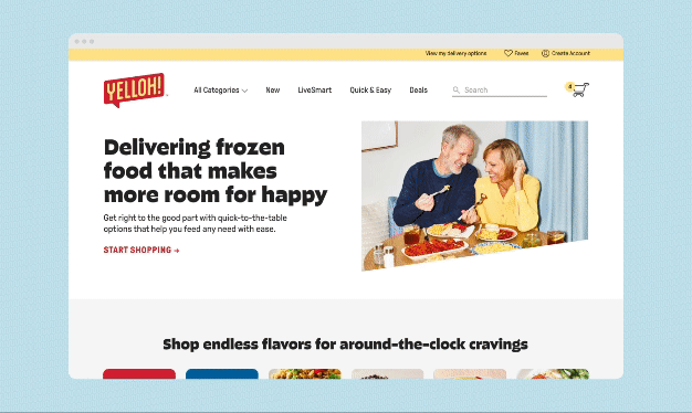
Yelloh.com is a modern leap for the original frozen food company.


“From the first naming ideas to the final logo, there was so much collaboration and spirited discussion…thank you for your thoughtful creative and strategy leadership.”
–Marketing Director, Yelloh